Nonparametric Density Estimation in R: KDE, Bandwidth Selection
Nonparametric density estimation lets you visualize the shape of a continuous variable without assuming any specific distribution. In R, the workhorse is density(), which builds a smooth kernel density estimate (KDE) by averaging tiny bumps placed at every observation.
How do you build a kernel density estimate in R?
Pick any continuous variable and you can see its shape in three lines of code. The base function density() does the heavy lifting: it places a small bump (a kernel) on each data point, sums all the bumps, and returns a smooth curve. Pass that curve to plot() and you get an instant picture of where values cluster, how skewed they are, and whether the distribution has more than one peak.
We'll start with faithful$eruptions, the eruption durations of Old Faithful. It's a built-in dataset and a classic teaching example because the distribution is clearly bimodal.
The plot shows two distinct peaks, around 2 minutes and 4.5 minutes, telling us short and long eruptions form separate clusters. A histogram with a poorly chosen bin width could easily hide that. The density object also reports a chosen bandwidth (bw = 0.3348) and 512 evaluation points by default. We'll come back to bandwidth in a moment.
Try it: Compute and plot the KDE of iris$Sepal.Length. Does the distribution look unimodal or multimodal?
Click to reveal solution
Explanation: density() accepts any numeric vector. The shoulder you see is the contribution of the larger species (versicolor and virginica) overlapping with setosa.
What does R's density() function actually return?
A density object is just a list with a few useful pieces. The two you'll reach for most often are x (the grid of input values where the estimate was evaluated, 512 points by default) and y (the estimated density at each grid point). Knowing the structure lets you treat the KDE as data, not just a plot.
Here's the full structure for the eruptions estimate.
bw is the bandwidth, n is the original sample size (272), and the x/y pair lets you read off the estimated density anywhere on the curve. Want the density at a specific value? Build a function from the curve with approxfun().
The two peaks have density values around 0.40 and 0.48 (the right peak is slightly taller), while the trough at 3 minutes is more than 7x lower. That ratio is what makes the bimodality visually clear and is also useful when you want to compute things like the relative likelihood of two values under the estimated distribution.
approxfun() turns a KDE into a callable function. That makes downstream computation easy: integrate over a region, find the mode with optimize(), or compare two distributions point-by-point.Try it: Use dfun() to estimate the density at x = 4 minutes. Is it closer to the trough or the peak?
Click to reveal solution
Explanation: 4.0 sits on the climb up to the right peak at 4.5, so the density (~0.32) is between the trough value (~0.06) and the peak value (~0.48).
Which kernel function should you choose?
A kernel is the small bump R places on each data point. density() supports seven shapes: gaussian (the default), epanechnikov, rectangular, triangular, biweight, cosine, and optcosine. Each is a non-negative function that integrates to 1. They differ in how their weight tapers off near the edges, but on real data the visual differences are tiny when the bandwidth is held fixed.
Let's overlay three of them at the same bandwidth so you can see for yourself.
The three curves trace almost the same shape. The rectangular kernel (a flat box) is a touch jagged at the edges; the other two are smooth. In published comparisons, the Epanechnikov kernel is theoretically optimal for minimizing mean integrated squared error, but the efficiency gap to Gaussian is roughly 5%, well below what bandwidth choice can do.
Try it: Re-plot the eruptions KDE with kernel = "epanechnikov" and the default bandwidth.
Click to reveal solution
Explanation: R picks the bandwidth with bw.nrd0 regardless of the kernel argument, so swapping kernels at the default settings barely moves the curve.
How do you select the bandwidth?
Bandwidth is the single most important choice in nonparametric density estimation. A small bandwidth makes every data point its own narrow spike (a wiggly, noisy curve). A large bandwidth blurs the data into one wide hill (oversmoothed, peaks gone). The good news: R ships with five data-driven selectors that pick a sensible value for you.
Silverman's rule of thumb is a closed-form formula based on the spread of the data:
$$h_{\text{Silverman}} = 0.9 \cdot \min\!\left(\hat\sigma, \frac{\text{IQR}}{1.34}\right) \cdot n^{-1/5}$$
Where:
- $\hat\sigma$ = sample standard deviation
- $\text{IQR}$ = interquartile range
- $n$ = sample size
It's fast and works well for unimodal, near-normal data. Other selectors (Scott's rule, unbiased and biased cross-validation, the Sheather-Jones plug-in) trade speed for better behavior on tricky distributions.
The five selectors disagree by more than a factor of three on the same data. Silverman, Scott, and biased cross-validation cluster around 0.33-0.40 (they assume something close to a smooth, single-peak shape). Unbiased CV and Sheather-Jones drop to ~0.10-0.14 because they detect that this distribution is bimodal and want a narrower bandwidth to preserve both peaks. That spread is exactly why the choice matters.
Now plot four KDEs with deliberately different bandwidths so you can see what each value does to the curve.
Look at the blue curve, at four times Silverman's bandwidth, the bimodal shape is gone and you'd never guess Old Faithful had two eruption regimes. The black curve has invented spurious peaks. Red and green both recover the truth, but the Sheather-Jones fit has cleaner, sharper peaks. That is the typical pattern: when in doubt, prefer bw.SJ.
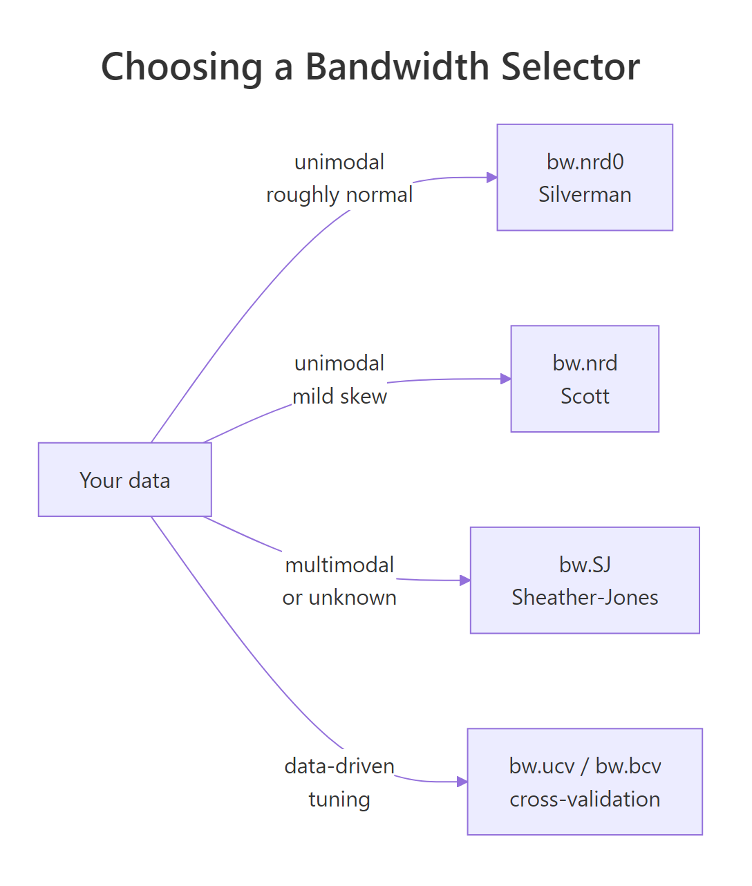
Figure 1: How to pick a bandwidth selector based on your data's shape.
bw.SJ when shape is unknown. It is the best general-purpose plug-in selector available and copes with multimodal distributions far better than Silverman's rule.Try it: Compute bw.SJ() on airquality$Wind. Is it larger or smaller than bw.nrd0() for the same vector?
Click to reveal solution
Explanation: Sheather-Jones gives roughly two-thirds of Silverman's value. The wind data has a small right shoulder; SJ shrinks the bandwidth to keep that detail.
How do you plot density curves in ggplot2?
geom_density() is the ggplot2 equivalent of plot(density(x)). It uses the same machinery under the hood and accepts the same bw and kernel arguments, plus an adjust multiplier that scales whatever bandwidth was picked.
The adjust argument is the fastest way to compare smoothness levels without recomputing bandwidths by hand. adjust = 0.5 halves the chosen bandwidth (more detail), adjust = 2 doubles it (smoother).
The red line keeps tiny bumps the truth probably doesn't have. The blue line collapses the bimodality into a flatter hill. The black middle setting is the default and looks right. adjust is a quick visual A/B knob: change one number, redraw, decide.
adjust is multiplicative on whatever bandwidth was chosen. That makes it consistent across selectors. If you switch bw = "SJ", adjust = 1.5 still means "1.5x whatever SJ picked," which is far more interpretable than typing raw numbers.Try it: Build a ggplot density of iris$Sepal.Length with one curve per Species, using fill = Species and alpha = 0.4.
Click to reveal solution
Explanation: Mapping fill = Species automatically groups the data and draws one curve per level. The alpha value lets all three remain visible where they overlap.
How do you estimate bivariate density (2D KDE)?
When you have two continuous variables, a 2D kernel density estimate gives you a heat map of joint density: how often each (x, y) region appears in the data. The base R implementation is MASS::kde2d(), and ggplot2 wraps it as geom_density_2d() and geom_density_2d_filled().
The image shows two warm spots (high joint density) corresponding to the two eruption regimes, short eruptions tend to follow short waits and long eruptions follow long waits. The contour lines highlight that the joint distribution has two distinct modes, mirroring the bimodality in the marginal eruption density.
For a publication-quality version with sensible defaults, use ggplot2.
Overlaying the raw points (in white) on the filled contours is a nice sanity check: the dense regions of the heat map should sit where the points actually cluster.
Try it: Build a 2D filled-contour density plot of mtcars$mpg (x) versus mtcars$wt (y) using geom_density_2d_filled().
Click to reveal solution
Explanation: geom_density_2d_filled() runs MASS::kde2d() internally and bins the result into filled contour bands, with aes(fill = stat(level)) mapped automatically.
Practice Exercises
Exercise 1: Compare three bandwidth selectors
Compute bw.nrd0, bw.SJ, and a manual bandwidth of 0.5 on airquality$Wind. Save the three values into a named numeric vector called my_bws. Print it.
Click to reveal solution
Explanation: Sheather-Jones picks a bandwidth two-thirds the size of Silverman's. The manual 0.5 value is even smaller and would produce the noisiest curve of the three.
Exercise 2: Faceted ggplot density per Species
Plot the density of iris$Sepal.Length faceted by Species in three panels. Use bw = "SJ" so each panel uses its own Sheather-Jones bandwidth, and store the plot as my_facet_plot.
Click to reveal solution
Explanation: Passing bw = "SJ" as a string tells ggplot2 to call bw.SJ() on each facet's subset of data, giving each species its own data-driven bandwidth.
Exercise 3: 2D density of Old Faithful with overlay
Build a bivariate density plot of faithful$eruptions (x) and faithful$waiting (y) using geom_density_2d() for unfilled contour lines, overlaid on a geom_point() scatter. Save the plot as my_kde2d.
Click to reveal solution
Explanation: Layering scatter + contour lines is a great sanity check for 2D KDE: if your contours don't enclose the dense regions of points, your bandwidth is wrong.
Complete Example
End-to-end pipeline on airquality$Wind: pick a sensible bandwidth, fit the KDE, evaluate the density at a point of interest, and produce a polished ggplot.
The full pipeline, top to bottom: drop missing values, choose bw.SJ because we don't want to assume normality, fit the KDE, expose it as a function so we can read off densities at any point of interest, then visualize with histogram + KDE overlay so the reader sees both the raw counts and the smoothed estimate.
Summary
| Task | Function | When to use |
|---|---|---|
| Build a 1D KDE | density(x) |
Any continuous variable |
| Evaluate KDE at a point | approxfun(d$x, d$y) |
Need numeric density values |
| Default bandwidth | bw.nrd0() (Silverman) |
Unimodal, near-normal data |
| Robust bandwidth | bw.SJ() (Sheather-Jones) |
Multimodal or unknown shape |
| Cross-validated bandwidth | bw.ucv() / bw.bcv() |
Want data-driven tuning |
| Plot in ggplot2 | geom_density() |
Publication-ready, supports groups |
| 2D density | MASS::kde2d() or geom_density_2d_filled() |
Two continuous variables |
Three key takeaways:
- Bandwidth dominates kernel. Pick the bandwidth carefully; let the kernel default to gaussian.
- Default to
bw.SJwhen the shape is unknown or potentially multimodal. It rarely fails badly. adjust=in ggplot2 is a multiplier, so you can A/B test smoothness without recomputing.
References
- R Core Team. density(), Kernel Density Estimation. R stats package documentation. Link
- R Core Team. Bandwidth Selectors for Kernel Density Estimation. R stats package documentation. Link
- Sheather, S. J. and Jones, M. C. (1991). A reliable data-based bandwidth selection method for kernel density estimation. Journal of the Royal Statistical Society B, 53, 683-690.
- Silverman, B. W. (1986). Density Estimation for Statistics and Data Analysis. Chapman and Hall.
- Wand, M. P. and Jones, M. C. (1995). Kernel Smoothing. Chapman and Hall, Monographs on Statistics and Applied Probability 60.
- Wickham, H. geom_density, Smoothed density estimates. ggplot2 documentation. Link
- Venables, W. N. and Ripley, B. D. MASS::kde2d(), Two-Dimensional Kernel Density Estimation. MASS package documentation. Link
Continue Learning
- When to Use Nonparametric Tests in R: Decision Guide, the parent decision guide that pointed you here.
- Mann-Whitney U Test in R, once your KDE shows two distributions look different, this is the rank-based test for the location difference.
- Wilcoxon Signed-Rank Test in R, the matched-pairs alternative to the t-test.