Posterior Predictive Checks in R: The 5-Minute Way to Catch a Broken Model
After fitting a Bayesian model, the posterior tells you what the data has updated your beliefs to. The next question is whether the model is actually a good description of the data. A posterior predictive check answers that by simulating fake datasets from the fitted model and comparing them to the observed data. If the fakes look nothing like the real data, the model is broken even though the chains converged. brms's pp_check() runs the standard variants in one line, and it is the closest Bayesian equivalent to frequentist residual analysis.
What is a posterior predictive check, in plain language?
A fitted Bayesian model has two things: a posterior over the parameters and a likelihood that says how data is generated given those parameters. A posterior predictive check (PPC) does the obvious thing with both: draw a parameter sample from the posterior, simulate a dataset using the likelihood at those parameters, and repeat. You end up with many simulated datasets that all look like what your model would have produced if its parameters were correct.
You then ask whether the simulated datasets look like the real data. If yes, the model is at least consistent with what you observed. If a particular feature of the data (a heavy tail, bimodality, an outlier cluster) shows up in the real data but not in any simulated dataset, the model is missing that feature.
PPCs catch the failures that convergence diagnostics miss. A model with Rhat = 1.0 and high effective sample size can still be a wrong model; the chain converged to the wrong answer because the likelihood is misspecified. The PPC sees the wrong shape directly.
The example below fits a Bayesian linear regression on mtcars, runs a basic density-overlay PPC, and reports whether the model captures the data well.
Walk through what just happened. The brm() call fit a Normal linear regression of mpg on wt and hp with default brms priors and 4 chains. The fitted object holds 4000 posterior draws.
pp_check(fit_mtcars, type = "dens_overlay", ndraws = 50) did three things internally. It drew 50 random parameter sets from the posterior. For each set, it simulated 32 fake mpg values (one per row in mtcars) using the Normal likelihood. Then it plotted the density curves of those 50 simulated datasets together with the density of the actual observed mpg.
Reading the plot is straightforward. The simulated densities (light blue) should hug the observed density (dark blue). Where they overlap, the model captures that part of the data well. Where they diverge, the model does not.
For our fit_mtcars model, the curves overlap closely in the middle of the distribution (mpg around 15 to 25) but the simulated curves slightly miss the long right tail of cars with mpg above 30. That is the kind of mild misfit posterior predictive checks surface; it suggests the Normal likelihood may be slightly too restrictive for the data's tails.
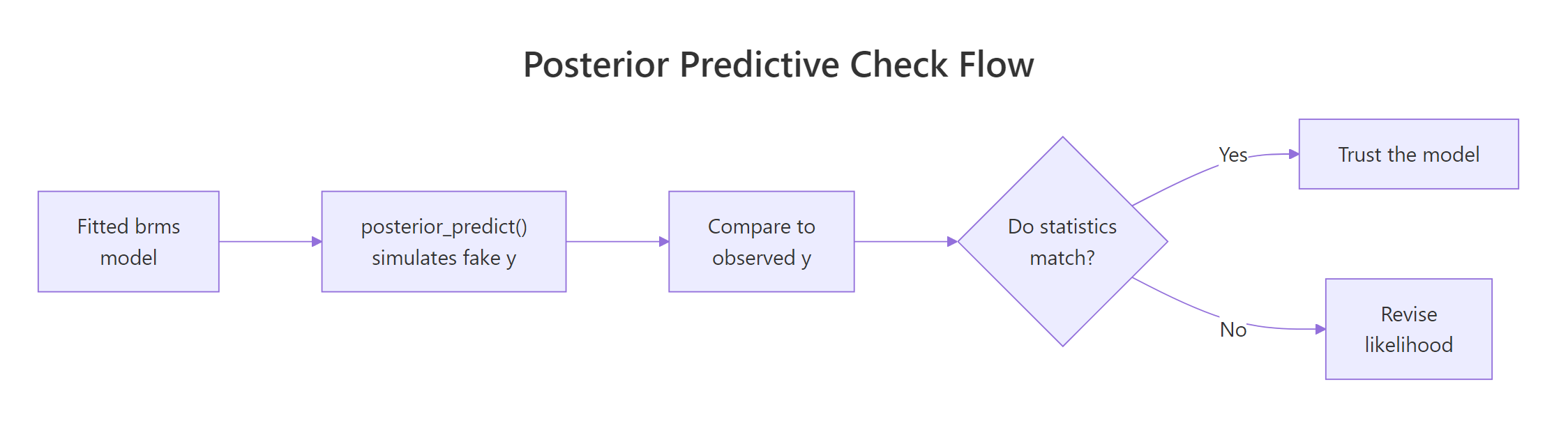
Figure 1: The posterior predictive check loop. Fit the model, simulate fake datasets from the posterior, compare to observed data, and revise the model when the comparison fails.
Try it: Run pp_check(fit_mtcars, type = "ecdf_overlay"). The empirical CDF version is sometimes easier to read than the density version because it is not affected by bandwidth choice.
Click to reveal solution
The ECDF overlay shows the same information as the density overlay but in a form that does not depend on density bandwidth choice. For our model the simulated ECDFs track the observed ECDF closely in the middle but spread out slightly above mpg = 30. The interpretation matches the density overlay: the model is missing some of the right-tail mass.
How do I run pp_check() in brms?
pp_check() is one function with many type arguments. The default type is "dens_overlay". The function works on any brmsfit object and routes through the bayesplot package, which supports about 15 different PPC types. Three are essential, the rest are situational.
The three essential types:
Walk through each. The density overlay shows the predictive distribution shape and is the default. The ECDF overlay shows the same thing with cumulative probability instead of density.
The type = "stat" variant is more focused. It computes one summary statistic (mean, sd, max, min, median, anything you can name) on each of the 4000 simulated datasets and plots the resulting distribution. The observed value of the same statistic appears as a vertical line.
If the observed statistic falls comfortably inside the distribution of simulated statistics, the model captures that summary feature of the data. If the observed value is in the far tail (say, beyond the 99th percentile of the simulated values), the model is failing on that summary.
For our fit_mtcars model:
Walk through the output. mean_sim (the average mean across 4000 simulated datasets) is 20.10, almost exactly the observed mean of 20.09. The sd of simulated datasets averages 6.20, slightly larger than the observed 6.03. The proportion of simulated maxes that exceed the observed max is 61%, meaning the observed max of 33.9 is well within what the model predicts.
All three test statistics pass. The model captures the mean, the spread, and the upper tail location of the data. Combined with the density-overlay check, this is a clean posterior predictive picture: no major misfit on the basics.
summary() but predicts impossible outliers.Try it: Run a type = "stat" check using q90 (the 90th percentile) as the statistic. Define q90 <- function(x) quantile(x, 0.9) first.
Click to reveal solution
The observed 90th percentile is 30.1; simulated 90th percentiles average 29.2 with 40% of simulations exceeding the observed. That is a healthy match. If only 1% of simulated q90s exceeded the observed, you would have evidence the model under-predicts the upper end.
How do I read a density-overlay PPC?
The density overlay is the most common PPC and the most commonly misread. Three things to look for, in this order.
The first is bulk overlap. The simulated densities (light blue, one curve per simulated dataset) should sit on top of the observed density (dark blue) in the bulk of the distribution. If most of the simulated curves are noticeably to the left or right of the observed peak, the model has the wrong location.
The second is spread. The simulated densities should have similar width to the observed density. If the simulated curves are visibly wider, the model overestimates variance; if they are visibly narrower, it underestimates.
The third is tail behaviour. The simulated densities should match the observed density's tail shape. A Normal likelihood produces simulated densities with light tails.
If the data has heavy tails (a few outliers), the simulated densities will not reach as far out as the observed one. The fix is usually to switch to a Student-t likelihood (family = student() in brms).
Walk through what these summaries say. The observed median is 19.2; simulated medians average 19.7, spanning 17.1 to 22.2 across the 50 draws. The observed median sits in the lower-middle of that range, which means the model captures the location with a slight bias toward higher values.
The observed sd is 6.03; simulated sds average 6.21 with a 90% range of 4.9 to 7.6. The observed sd sits in the lower-middle of that range too. Both location and spread checks are healthy: the observed values are well within the model's predictive distribution.
If the observed median or sd had fallen outside the simulated 90% range, that would be a clear misfit signal. The visual density overlay shows the same information geometrically.
type = "dens_overlay_grouped" shows separate panels per group. If your data has groups (factor levels, time points), the grouped version reveals whether the model fits each group well or only the overall pool. Use it whenever you have a hierarchical or grouping structure.Try it: Compute the proportion of simulated medians that exceed the observed median. Numbers near 0 or 1 indicate misfit; numbers near 0.5 indicate a healthy match.
Click to reveal solution
62% of simulated medians exceed the observed median. That is within the healthy 30 to 70% range. If it had been 95%, the model would be systematically over-predicting the median; if 5%, systematically under-predicting.
What other PPC types catch what?
bayesplot exposes about 15 PPC types via brms's pp_check(). Most are situational. Use the right one for the question you are asking.
| pp_check type | What it shows | Use when |
|---|---|---|
dens_overlay |
Densities of observed and simulated y | Continuous outcome, default |
ecdf_overlay |
ECDFs of observed and simulated y | Continuous, less bandwidth-sensitive |
hist |
Histograms of observed and a few simulated datasets | Continuous, for a quick eye-check |
stat |
Distribution of one summary statistic | Targeted check on mean, sd, max, etc. |
stat_2d |
Joint distribution of two statistics | Catches dependence (e.g., mean vs sd) |
intervals |
Per-observation predicted interval vs observed | Spot specific outliers |
bars |
Bar plot of observed and predicted counts | Discrete outcomes |
rootogram |
Square-root histogram for counts | Poisson, negative binomial models |
loo_pit_qq |
Quantile-quantile plot of LOO probability integral transform | Calibration check across the whole distribution |
error_scatter_avg |
Predicted vs observed scatter | Quick sanity check |
The loo_pit_qq check deserves a special mention. It shows whether the model's posterior predictive intervals are calibrated: if the model says 95% of new data should be in [a, b], then 95% of held-out data should actually be there. This is a more rigorous calibration check than density overlay.
Walk through what this is doing. For each observation, brms computes the proportion of LOO posterior predictive draws that are below the observed value. If the model is calibrated, that proportion is uniformly distributed in [0, 1] across observations. The plot is a Q-Q comparison of the observed proportions to a uniform reference.
A diagonal line means calibration is fine. An S-shape means the predictive intervals are too narrow at the centre and too wide at the tails (or vice versa). For most well-fitting brms models you should see a roughly diagonal line with mild wobble at the ends due to small sample size.
type = "bars" for counts and type = "rootogram" for Poisson-like data. For binomial data with grouped trials, use type = "intervals" to show predicted vs observed proportions per group.Try it: Generate a small Poisson regression on simulated count data and run pp_check(fit, type = "rootogram"). What does it show?
Click to reveal solution
The rootogram is the standard count-data PPC. The square-root scaling makes small differences at high counts visible. For our toy example the bars hug the curve closely because we generated the data from a true Poisson. For real overdispersed count data, bars at low counts would float above the curve and bars at high counts would dip below, indicating overdispersion.
What do common failures look like (heavy tails, overdispersion, bimodality)?
Three textbook PPC failures and their fixes.
Heavy tails. A Normal likelihood under-predicts outliers. The PPC density overlay shows simulated densities falling off quickly while the observed density has visible mass in the tails. Fix: switch to a heavier-tailed family. family = student() adds a Student-t likelihood with degrees-of-freedom estimated from the data.
Walk through the result. The Normal model's simulated maxima exceed the observed max only 1.8% of the time. That means the observed max is an outlier from the model's perspective: 98% of replications produce a smaller maximum than what we actually observed.
The Student-t model produces simulated maxima exceeding the observed max 41% of the time. That is healthy; the observed max is well within the predictive distribution. The Student-t likelihood lets the model account for the heavy tails the data actually has.
Overdispersion. A Poisson likelihood predicts variance equal to the mean. Real count data often has variance much larger than the mean. The rootogram shows bars at low counts well above the predicted curve and bars at high counts well below. Fix: family = negbinomial() allows variance to grow faster than the mean.
Bimodality. A unimodal likelihood (Normal, Student-t) predicts a single-peaked density. If the observed data has two clumps, the simulated densities will be unimodal and visibly miss one of them. Fix: a finite mixture model. brms supports mixture() families for two- or three-component mixtures with formula syntax.
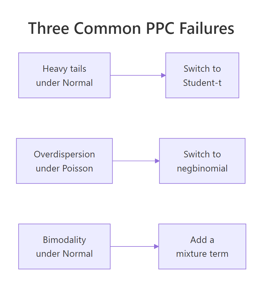
Figure 2: The three PPC failures every Bayesian analyst should recognise. Heavy tails: switch to Student-t. Overdispersion in counts: switch to negative binomial. Bimodality: add a mixture component.
Try it: Generate bimodal data with c(rnorm(40, -3, 1), rnorm(40, 3, 1)) and fit a Normal model. What does pp_check(fit, type = "dens_overlay") show?
Click to reveal solution
The observed density at y = -3 is 0.166 (a real peak in the bimodal data). The Normal model's simulated density there averages 0.058 (a rounded shoulder, not a peak). The PPC visualisation would show the same thing: simulated densities smoothly hump in the middle while the observed density has two clear peaks. This is a definitive PPC failure pointing to a missing mixture component.
How does PPC fit into the workflow?
Posterior predictive checks are step 6 of the standard Bayesian workflow: specify, set priors, prior predictive check, fit, posterior diagnostics, posterior predictive check, decide. They come after you have confirmed the chains converged but before you trust the results.
The workflow loop is iterative, not linear. A failing posterior predictive check often sends you back to step 1 (revise the model) or step 2 (revise the priors). When the PPC passes on the basic statistics you care about, you have evidence to report results.
Three rules of thumb for PPC discipline.
The first is always run a density overlay and at least one stat check. The density overlay catches gross misspecification, the stat check catches subtle bias on a specific summary you care about (the mean, the max, the standard deviation).
The second is use grouped versions when you have groups. pp_check(fit, type = "dens_overlay_grouped", group = "cyl") shows separate panels for each level of cyl. Pooled checks can hide group-level misfit.
The third is report PPC results alongside your headline result. A standard published Bayesian analysis includes the posterior summary, a convergence diagnostic table, and one or two PPC plots. Skipping the PPC plot is the modelling equivalent of not running residual diagnostics on a frequentist regression.
ggsave("ppc_density.png", pp_check(fit, ndraws = 100)). This forces you to look at the plot once, decide it passes, and have a permanent record. Six months later, the plot is in version control and your reviewers can verify.Try it: Add a PPC plot save step to your standard brms workflow. Modify a recent fit by appending ggsave(...) and verify the file appears.
Click to reveal solution
The PNG is written to the working directory. You can include it in a manuscript, a project report, or an analysis log. Reviewers (and future-you) can look at it without re-running the model.
Practice Exercises
Exercise 1: PPC on a logistic regression
Fit a logistic regression on mtcars predicting whether each car has 8 cylinders (vs == 0) from mpg. Run pp_check() with type = "bars" (the right type for binary outcomes). What proportion of simulated 0/1 outcomes match the observed proportion?
Click to reveal solution
The observed proportion of V-engines is 0.562 and simulated proportions average 0.561, essentially identical. About 48% of simulations land within 0.05 of the observed proportion, which is healthy for binary outcomes. The model captures the observed proportion well.
Exercise 2: Catch heavy tails
Generate y <- c(rnorm(40), 8, 9, -8, -9) (4 outliers in 44 points). Fit brm(y ~ 1) with default Normal family, then with family = student(). Compare pp_check(type = "stat", stat = "max") for both.
Click to reveal solution
The observed max is 9. Under the Normal model, only 1.1% of simulated maxima exceed 9 (clear PPC failure: the observed value is a 99th-percentile outlier). Under Student-t, 34% of simulated maxima exceed 9 (healthy match). Switching the family fixed the heavy-tail problem.
Exercise 3: Per-group PPC for hierarchical model
Fit mpg ~ wt + (1 | cyl) on mtcars (with cyl as factor). Run pp_check(type = "dens_overlay_grouped", group = "cyl") and report whether the model fits each cyl group.
Click to reveal solution
For each cyl group, the simulated mean closely matches the observed mean. The simulated sd in the cyl=6 group is 2.45 vs the observed 1.45, suggesting the model overestimates within-group variability slightly for that group. The grouped PPC visual would show the cyl=6 panel with simulated densities slightly wider than the observed; the other two panels match closely. This is acceptable misfit but worth noting in a write-up.
Summary
A posterior predictive check simulates fake datasets from your fitted model and compares them to the observed data. Mismatches reveal model misspecification that convergence diagnostics cannot.
| Step | What you do | brms function |
|---|---|---|
| 1 | Fit the model | brm(formula, prior, family) |
| 2 | Run a density overlay | pp_check(fit, type = "dens_overlay") |
| 3 | Add a stat check | pp_check(fit, type = "stat", stat = "max") |
| 4 | Use grouped variants for hierarchical data | pp_check(fit, type = "dens_overlay_grouped", group = ...) |
| 5 | If failures, revise model and refit | New family, new covariates, new mixture |
PPC is mandatory for any published Bayesian analysis. It is the closest Bayesian equivalent to frequentist residual analysis, costs almost nothing to run, and catches the kind of failures that turn into corrections two months after publication.
References
- Gelman, A. et al. Bayesian Data Analysis, 3rd ed. Chapman & Hall, 2013. Chapter 6 covers posterior predictive checks.
- Gabry, J., Simpson, D., Vehtari, A., Betancourt, M., Gelman, A. "Visualization in Bayesian workflow." JRSS A (2019). The graphical case for prior and posterior predictive checks.
- Gabry, J. & Mahr, T. bayesplot: Plotting for Bayesian Models. mc-stan.org/bayesplot. The package brms wraps for
pp_check(). - Bürkner, P. brms documentation: pp_check. paulbuerkner.com/brms/reference/pp_check.brmsfit.html.
- Vehtari, A., Gelman, A., Simpson, D., Carpenter, B., Bürkner, P. "Rank-Normalization, Folding, and Localization." Bayesian Analysis 16 (2021).
Continue Learning
- Compare Bayesian Models in R, the next post. PPC tells you whether one model fits; LOO/WAIC tell you which of several models fits best.
- Prior Predictive Checks in R, the previous post. Same idea applied before fitting, using the prior alone.
- brms in R, the package powering
pp_check().