Descriptive Statistics in R: The 8 Numbers That Tell You What Your Data Is Doing

Descriptive statistics are the handful of numbers — mean, median, standard deviation, quartiles, skewness — that summarise a dataset so you can understand its centre, spread, and shape before doing any modelling or testing. In R, summary() gives you six of these in one call, and a few extra functions complete the picture.

What does summary() tell you about your data?

Every analysis starts with the same question: what does this data actually look like? Before you fit models or run tests, you need to know where the centre is, how spread out the values are, and whether anything looks unusual. Let's start with R's built-in summary() — it gives you six key numbers in one line.

RInteractive R
# Quick snapshot of a single column summary(airquality$Ozone) #> Min. 1st Qu. Median Mean 3rd Qu. Max. NA's #> 1.00 18.00 31.50 42.13 63.25 168.00 37 # Full data frame overview summary(airquality) #> Ozone Solar.R Wind Temp Month #> Min. : 1.00 Min. : 7 Min. : 1.7 Min. :56.0 Min. :5 #> 1st Qu.: 18.00 1st Qu.:116 1st Qu.: 7.4 1st Qu.:72.0 1st Qu.:6 #> Median : 31.50 Median :205 Median : 9.7 Median :79.0 Median :7 #> Mean : 42.13 Mean :186 Mean : 9.96 Mean :77.9 Mean :7 #> 3rd Qu.: 63.25 3rd Qu.:259 3rd Qu.:11.5 3rd Qu.:85.0 3rd Qu.:8 #> Max. :168.00 Max. :334 Max. :20.7 Max. :97.0 Max. :9 #> NA's :37 NA's :7


Look at Ozone: the mean (42.13) is noticeably higher than the median (31.50). That gap tells you the data is right-skewed — a few very high ozone days are pulling the average up. You also see 37 missing values, which is important to know before you compute anything else.

Tip
Run summary() on the whole data frame, not just one column. You get per-column stats plus NA counts for every variable at once — the fastest way to spot problems in a new dataset.

When summary() reports NA's, that means those values were excluded from the min, max, mean, median, and quartile calculations. R did not silently treat them as zeros.

Try it: Run summary(mtcars$mpg). The output shows six numbers. A car that gets 21 mpg — does it fall above or below the median? Above or below the third quartile?

RInteractive R
# Try it: interpret summary() output summary(mtcars$mpg) #> Expected: check whether 21 falls between Median and 3rd Qu.

  
Click to reveal solution
RInteractive R
summary(mtcars$mpg) #> Min. 1st Qu. Median Mean 3rd Qu. Max. #> 10.40 15.43 19.20 20.09 22.80 33.90


Explanation: The median is 19.20 and the third quartile is 22.80, so 21 mpg falls above the median but below Q3. This car is in the upper half of fuel efficiency but not in the top 25%.

How do you calculate mean, median, and mode in R?

These three numbers answer the simplest possible question: where is the centre of your data? But they answer it in very different ways, and choosing the wrong one can mislead you.

The mean is the balance point — add up every value and divide by the count. The median is the middle value when you sort the data. The mode is whichever value appears most often.

Here's why the distinction matters. Imagine 10 people each earning \$50,000, plus one billionaire. The mean income is about \$91 million. The median is still \$50,000. The mean is technically correct but completely misleading — the median tells the real story.

RInteractive R
# Mean and median of ozone levels (skip NAs) ozone_mean <- mean(airquality$Ozone, na.rm = TRUE) ozone_med <- median(airquality$Ozone, na.rm = TRUE) cat("Mean:", ozone_mean, "\n") #> Mean: 42.12931 cat("Median:", ozone_med, "\n") #> Median: 31.5


The mean (42.1) is about 34% higher than the median (31.5). That's a strong hint of right skew — a handful of very high ozone days are dragging the mean upward.

Warning
R's mode() function does NOT return the statistical mode. It returns the storage type of the object (like "numeric" or "character"). To find the most frequent value, write a small helper function.

R has no built-in function for the statistical mode, so here's a simple one:

RInteractive R
# Custom function for the statistical mode stat_mode <- function(x) { ux <- unique(x) ux[which.max(tabulate(match(x, ux)))] } stat_mode(c(1, 2, 2, 3, 3, 3, 4)) #> [1] 3


tabulate(match(x, ux)) counts how often each unique value appears, then which.max() finds the position of the largest count. For continuous data like ozone levels, the mode is rarely useful — it's more helpful for categorical or integer data.

When should you report which measure? If mean and median are close, the data is roughly symmetric and either works. If the mean is much larger than the median, the data is right-skewed and the median is more representative.

RInteractive R
# Compare mean vs median: which is more representative? cat("Mean - Median =", ozone_mean - ozone_med, "\n") #> Mean - Median = 10.62931 cat("Ratio: Mean / Median =", round(ozone_mean / ozone_med, 2), "\n") #> Ratio: Mean / Median = 1.34


A mean/median ratio of 1.34 confirms right skew. For ozone levels, the median (31.5 ppb) is the better summary — it tells you what a "typical" day looks like, without being distorted by extreme days.

Try it: Calculate the mean and median of mtcars$hp. Is the mean higher than the median? What does that tell you about the distribution of horsepower?

RInteractive R
# Try it: mean vs median of horsepower ex_hp_mean <- mean(mtcars$hp) ex_hp_med <- median(mtcars$hp) # Compare and decide: symmetric or skewed?

  
Click to reveal solution
RInteractive R
ex_hp_mean <- mean(mtcars$hp) ex_hp_med <- median(mtcars$hp) cat("Mean:", ex_hp_mean, " Median:", ex_hp_med, "\n") #> [1] Mean: 146.6875 Median: 123 cat("Mean > Median:", ex_hp_mean > ex_hp_med, "\n") #> [1] Mean > Median: TRUE


Explanation: The mean (146.7) is higher than the median (123), indicating right skew. A few high-horsepower cars (like the Maserati Bora at 335 hp) pull the mean up.

How do you measure spread with standard deviation and IQR?

Knowing the centre isn't enough. Two datasets can have the same mean but wildly different spreads — exam scores clustered around 75% vs scattered from 20% to 100%. Spread statistics tell you how much the values vary.

Standard deviation (SD) measures the average distance from the mean. Interquartile range (IQR) measures the width of the middle 50% of the data (Q3 minus Q1). SD is sensitive to outliers; IQR is robust against them.

The formula for standard deviation captures this intuition — it's the square root of the average squared distance from the mean:

$$s = \sqrt{\frac{1}{n-1} \sum_{i=1}^{n} (x_i - \bar{x})^2}$$

Where:

  • $s$ = sample standard deviation
  • $n$ = number of observations
  • $x_i$ = each individual value
  • $\bar{x}$ = the sample mean

If you're not interested in the math, skip ahead — the practical code below is all you need.

RInteractive R
# Four measures of spread ozone <- airquality$Ozone[!is.na(airquality$Ozone)] ozone_sd <- sd(ozone) ozone_var <- var(ozone) ozone_iqr <- IQR(ozone) ozone_rng <- range(ozone) cat("SD:", round(ozone_sd, 2), "\n") #> SD: 32.99 cat("Variance:", round(ozone_var, 2), "\n") #> Variance: 1088.2 cat("IQR:", ozone_iqr, "\n") #> IQR: 45.25 cat("Range:", ozone_rng[1], "to", ozone_rng[2], "\n") #> Range: 1 to 168


The SD of 32.99 tells you that a typical ozone reading is about 33 ppb away from the mean (42.1). The IQR of 45.25 tells you the middle 50% of readings span a 45-ppb window. The range shows the full extent — from 1 ppb to 168 ppb, a massive spread.

Here's why the pairing matters. Let's inject an extreme outlier and see which statistic moves more:

RInteractive R
# How sensitive are SD and IQR to outliers? clean <- c(10, 12, 14, 15, 16, 18, 20) with_outlier <- c(clean, 500) cat("Clean data: SD =", round(sd(clean), 1), " IQR =", IQR(clean), "\n") #> Clean data: SD = 3.4 IQR = 4 cat("With outlier: SD =", round(sd(with_outlier), 1), " IQR =", IQR(with_outlier), "\n") #> With outlier: SD = 170.6 IQR = 5.5


Adding one value of 500 exploded the SD from 3.4 to 170.6 — a 50x increase. The IQR barely moved (4 to 5.5). That's why IQR is the go-to spread measure for skewed data or data with outliers.

Key Insight
SD pairs with mean, IQR pairs with median — always report them together. If the data is symmetric, use mean + SD. If it's skewed or has outliers, switch to median + IQR. Mixing pairs (like mean + IQR) sends a confusing signal.

Try it: Calculate the SD and IQR of mtcars$wt (car weight in thousands of pounds). Which measure gives a clearer picture of how much typical car weights vary?

RInteractive R
# Try it: SD vs IQR for car weight ex_wt_sd <- sd(mtcars$wt) ex_wt_iqr <- IQR(mtcars$wt) # your interpretation here

  
Click to reveal solution
RInteractive R
ex_wt_sd <- sd(mtcars$wt) ex_wt_iqr <- IQR(mtcars$wt) cat("SD:", round(ex_wt_sd, 3), " IQR:", round(ex_wt_iqr, 3), "\n") #> [1] SD: 0.978 IQR: 1.029 cat("Mean:", round(mean(mtcars$wt), 3), " Median:", round(median(mtcars$wt), 3), "\n") #> [1] Mean: 3.217 Median: 3.325


Explanation: SD (0.978) and IQR (1.029) are close, suggesting the data is fairly symmetric. Since mean and median are also close (3.22 vs 3.33), either pair works here.

What do quantiles and percentiles reveal about your data?

Quantiles split your data into equal-sized chunks. Quartiles split into 4 parts (that's where Q1, Q2/median, Q3 come from). Percentiles split into 100 parts, so the 90th percentile means "90% of values fall below this."

Quantiles answer questions that mean and SD cannot: "What value marks the top 10%?" or "What range covers the middle 80% of observations?"

RInteractive R
# Default quartiles (0%, 25%, 50%, 75%, 100%) quantile(ozone) #> 0% 25% 50% 75% 100% #> 1.00 18.00 31.50 63.25 168.00


The default output matches what summary() gave you — the five-number summary. But quantile() lets you ask for any percentile you want:

RInteractive R
# Custom percentiles: where do 90% of the values fall? quantile(ozone, probs = c(0.05, 0.10, 0.90, 0.95)) #> 5% 10% 90% 95% #> 4.75 7.00 97.00 108.50


The 5th percentile is 4.75 ppb and the 95th is 108.5 ppb — 90% of ozone readings fall within that range. The wide spread (4.75 to 108.5) confirms there's a lot of variability in this data.

R also has fivenum(), which gives a slightly different result than quantile():

RInteractive R
# fivenum() vs quantile() fivenum(ozone) #> [1] 1.0 18.0 31.5 63.5 168.0 quantile(ozone) #> 0% 25% 50% 75% 100% #> 1.00 18.00 31.50 63.25 168.00


Notice Q3 is 63.5 from fivenum() but 63.25 from quantile(). The difference is the algorithm: fivenum() uses the Tukey method while quantile() defaults to type 7. For most practical purposes, the difference is negligible.

Note
R has 9 quantile algorithms (type 1 through 9). The default is type 7. If you need the textbook definition (which averages the two middle values), use quantile(x, type = 6). For large datasets, all 9 types converge to the same answer.

Try it: Find the 5th and 95th percentiles of airquality$Temp. What temperature range covers 90% of the summer days?

RInteractive R
# Try it: temperature range for the middle 90% ex_temp_pctiles <- quantile(airquality$Temp, probs = c(0.05, 0.95)) # What's the range?

  
Click to reveal solution
RInteractive R
ex_temp_pctiles <- quantile(airquality$Temp, probs = c(0.05, 0.95)) ex_temp_pctiles #> 5% 95% #> 59.0 94.0 cat("90% of days fall between", ex_temp_pctiles[1], "and", ex_temp_pctiles[2], "°F\n") #> [1] 90% of days fall between 59 and 94 °F


Explanation: The middle 90% of days ranged from 59°F to 94°F. The full range is 56 to 97°F, so the extreme 10% only adds a few degrees at each end — temperature is less variable than ozone.

What do skewness and kurtosis tell you about shape?

So far you've measured where the centre is (mean, median) and how spread out the values are (SD, IQR). The last piece of the puzzle is shape — is the data symmetric, or does it lean to one side?

Skewness measures how lopsided the distribution is. Picture a seesaw: if the right tail is longer (a few very large values), skewness is positive. If the left tail is longer, it's negative. A perfectly symmetric distribution has skewness = 0.

Kurtosis measures how heavy the tails are. Higher kurtosis means more outlier-prone data. A normal distribution has a kurtosis of about 3 (or 0 when "excess kurtosis" is reported).

The psych package's describe() gives you both in one call:

RInteractive R
library(psych) # Skewness and kurtosis for ozone describe(airquality$Ozone) #> vars n mean sd median trimmed mad min max range skew kurtosis se #> X1 1 116 42.13 32.99 31.5 38.17 25.95 1 168 167 1.21 1.11 3.06


Ozone has a skewness of 1.21 — that's solidly right-skewed (positive). The kurtosis of 1.11 (excess kurtosis) tells you the tails are heavier than a normal distribution, meaning extreme ozone days are more common than you'd expect from a bell curve.

Here's a quick rule of thumb for interpreting skewness:

  • |skew| < 0.5: approximately symmetric
  • 0.5 ≤ |skew| < 1: moderately skewed
  • |skew| ≥ 1: heavily skewed

Let's compare a skewed variable (Ozone) with a near-symmetric one (Temp):

RInteractive R
# Compare shape: Ozone vs Temp describe(airquality[, c("Ozone", "Temp")]) #> vars n mean sd median trimmed mad min max range skew kurtosis #> Ozone 1 116 42.13 32.99 31.5 38.17 25.95 1 168 167 1.21 1.11 #> Temp 2 153 77.88 9.47 79.0 78.28 8.90 56 97 41 -0.37 -0.46 #> se #> Ozone 3.06 #> Temp 0.77


Ozone: skew = 1.21 (heavily right-skewed). Report median + IQR. Temp: skew = -0.37 (approximately symmetric). Report mean + SD.

Three families of descriptive statistics: centre, spread, and shape

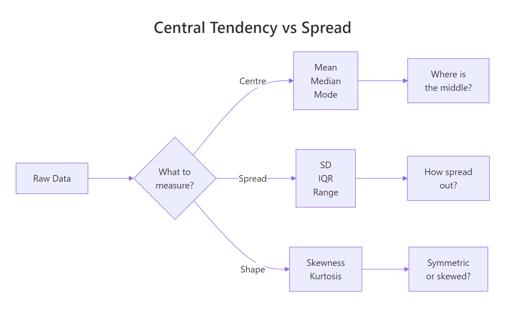
Figure 1: Three families of descriptive statistics: centre, spread, and shape.

Key Insight
If |skewness| is greater than 1, report median + IQR instead of mean + SD. The mean is being pulled by the tail, so it misrepresents the "typical" value. This is the single most common mistake in reporting descriptive statistics.

Try it: Use describe() from psych on mtcars$disp (engine displacement). Is it skewed? Would you report mean or median?

RInteractive R
# Try it: check shape of engine displacement ex_disp_desc <- describe(mtcars$disp) # Check the skew value and decide

  
Click to reveal solution
RInteractive R
ex_disp_desc <- describe(mtcars$disp) cat("Skewness:", round(ex_disp_desc$skew, 2), "\n") #> [1] Skewness: 0.38


Explanation: The skewness is 0.38, which is below 0.5 — approximately symmetric. You can report mean + SD for displacement. Mean = 230.7, SD = 123.9.

How do you summarise statistics by group with dplyr?

Real analysis almost always involves groups. You don't just want the average ozone level — you want it by month. You don't want overall horsepower — you want it by number of cylinders. The dplyr package's group_by() |> summarise() pipeline handles this cleanly.

RInteractive R
library(dplyr) # Monthly ozone and temperature summaries monthly_stats <- airquality |> group_by(Month) |> summarise( n = n(), mean_temp = round(mean(Temp), 1), sd_temp = round(sd(Temp), 1), mean_oz = round(mean(Ozone, na.rm = TRUE), 1), .groups = "drop" ) monthly_stats #> # A tibble: 5 × 5 #> Month n mean_temp sd_temp mean_oz #> <int> <int> <dbl> <dbl> <dbl> #> 1 5 31 65.5 6.9 23.6 #> 2 6 30 79.1 6.6 29.4 #> 3 7 31 83.9 4.3 59.1 #> 4 8 31 84.0 3.5 60.0 #> 5 9 30 76.9 8.4 31.4


July and August have the highest average ozone (59–60 ppb) and temperature (84°F), while May is the coolest and cleanest. Notice that September's temperature SD (8.4) is much higher than August's (3.5) — September weather is more variable.

If you need summaries for every numeric column at once, across() saves you from repeating the same code:

RInteractive R
# Summarise all numeric columns by month airquality |> group_by(Month) |> summarise( across(where(is.numeric), \(x) round(mean(x, na.rm = TRUE), 1)), .groups = "drop" ) #> # A tibble: 5 × 6 #> Month Ozone Solar.R Wind Temp Day #> <int> <dbl> <dbl> <dbl> <dbl> <dbl> #> 1 5 23.6 181.3 11.6 65.5 16.0 #> 2 6 29.4 190.2 10.3 79.1 15.5 #> 3 7 59.1 216.5 8.9 83.9 16.0 #> 4 8 60.0 171.9 8.8 84.0 16.0 #> 5 9 31.4 167.4 10.2 76.9 15.5


If you prefer base R, aggregate() does the same thing without loading any packages:

RInteractive R
# Base R alternative aggregate(Temp ~ Month, data = airquality, FUN = mean) #> Month Temp #> 1 5 65.54839 #> 2 6 79.10000 #> 3 7 83.90323 #> 4 8 83.96774 #> 5 9 76.90000

  
Tip
Use across() with where(is.numeric) to summarise all numeric columns at once. Instead of writing separate lines for mean_temp, mean_wind, mean_ozone, one across() call handles them all.

Try it: Group mtcars by cyl (number of cylinders) and compute the mean mpg and median hp per group. Which cylinder count has the best fuel economy?

RInteractive R
# Try it: grouped summary of mtcars ex_cyl_stats <- mtcars |> group_by(cyl) |> summarise( # your code here )

  
Click to reveal solution
RInteractive R
ex_cyl_stats <- mtcars |> group_by(cyl) |> summarise( mean_mpg = round(mean(mpg), 1), median_hp = median(hp), .groups = "drop" ) ex_cyl_stats #> # A tibble: 3 × 3 #> cyl mean_mpg median_hp #> <dbl> <dbl> <dbl> #> 1 4 26.7 91 #> 2 6 19.7 110 #> 3 8 15.1 192.5


Explanation: 4-cylinder cars get the best fuel economy (26.7 mpg), while 8-cylinder cars get the worst (15.1 mpg) but have the most power (median 192.5 hp).

Which descriptive statistics should you report?

You now have a toolbox full of individual statistics. But when you're writing a report or preparing data for a model, which ones do you actually include? Here's the 8-number framework that covers every case:

  1. n — sample size
  2. Mean — centre (if symmetric)
  3. SD — spread (if symmetric)
  4. Median — centre (if skewed)
  5. IQR — spread (if skewed)
  6. Min — lower bound
  7. Max — upper bound
  8. Skewness — shape indicator (tells you whether to report mean+SD or median+IQR)

Decision flow: choose mean + SD or median + IQR based on skewness

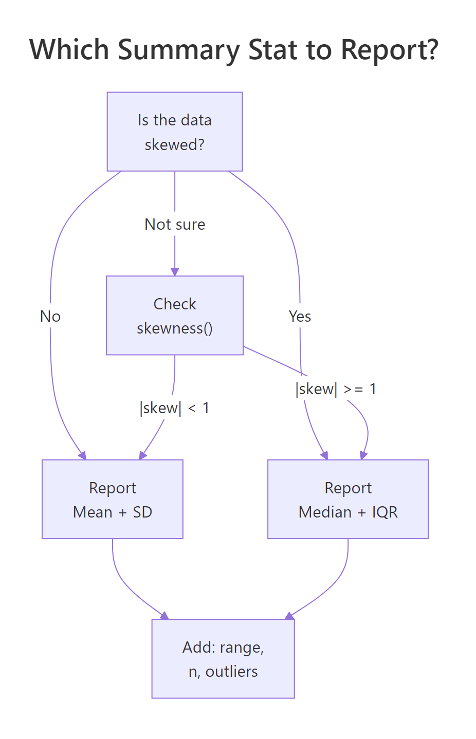
Figure 2: Decision flow: choose mean + SD or median + IQR based on skewness.

Let's build a complete summary table that computes all 8 numbers:

RInteractive R
# The 8-number summary for every numeric column full_summary <- airquality |> summarise(across( c(Ozone, Solar.R, Wind, Temp), list( n = \(x) sum(!is.na(x)), mean = \(x) round(mean(x, na.rm = TRUE), 1), sd = \(x) round(sd(x, na.rm = TRUE), 1), median = \(x) median(x, na.rm = TRUE), iqr = \(x) IQR(x, na.rm = TRUE), min = \(x) min(x, na.rm = TRUE), max = \(x) max(x, na.rm = TRUE), skew = \(x) round(psych::describe(x)$skew, 2) ), .names = "{.col}__{.fn}" )) # Reshape for readability library(tidyr) full_summary |> pivot_longer(everything(), names_to = c("variable", "stat"), names_sep = "__") |> pivot_wider(names_from = stat, values_from = value) #> # A tibble: 4 × 9 #> variable n mean sd median iqr min max skew #> <chr> <dbl> <dbl> <dbl> <dbl> <dbl> <dbl> <dbl> <dbl> #> 1 Ozone 116 42.1 33.0 31.5 45.2 1 168 1.21 #> 2 Solar.R 146 186.0 90.1 205 143.5 7 334 -0.42 #> 3 Wind 153 10.0 3.5 9.7 4.1 1.7 20.7 0.34 #> 4 Temp 153 77.9 9.5 79 13 56 97 -0.37


From this table, you can immediately see: Ozone (skew = 1.21) should be reported with median + IQR. The other three variables (|skew| < 0.5) are fine with mean + SD.

For a quick all-in-one report without building the table yourself, psych::describe() covers most of the 8 numbers:

RInteractive R
# Quick all-in-one report describe(airquality[, c("Ozone", "Solar.R", "Wind", "Temp")]) #> vars n mean sd median trimmed mad min max range skew kurtosis #> Ozone 1 116 42.13 32.99 31.50 38.17 25.95 1 168 167 1.21 1.11 #> Solar.R 2 146 185.93 90.06 205.00 191.04 98.59 7 334 327 -0.42 -0.90 #> Wind 3 153 9.96 3.52 9.70 9.87 3.41 2 21 19 0.34 -0.15 #> Temp 4 153 77.88 9.47 79.00 78.28 8.90 56 97 41 -0.37 -0.46 #> se #> Ozone 3.06 #> Solar.R 7.45 #> Wind 0.28 #> Temp 0.77

  
Key Insight
Always report sample size (n). A mean from 5 observations means something very different from a mean from 5,000. Readers need n to judge how much to trust the other numbers.

Try it: Build a summary of airquality$Wind with all 8 numbers. Based on the skewness, should you report mean + SD or median + IQR?

RInteractive R
# Try it: 8-number summary for Wind ex_wind_n <- sum(!is.na(airquality$Wind)) ex_wind_mean <- round(mean(airquality$Wind), 1) # complete the remaining 6 stats

  
Click to reveal solution
RInteractive R
ex_wind <- airquality$Wind cat("n:", sum(!is.na(ex_wind)), "\n") #> [1] n: 153 cat("Mean:", round(mean(ex_wind), 1), " SD:", round(sd(ex_wind), 1), "\n") #> [1] Mean: 10 SD: 3.5 cat("Median:", median(ex_wind), " IQR:", IQR(ex_wind), "\n") #> [1] Median: 9.7 IQR: 4.1 cat("Min:", min(ex_wind), " Max:", max(ex_wind), "\n") #> [1] Min: 1.7 Max: 20.7 cat("Skewness:", round(psych::describe(ex_wind)$skew, 2), "\n") #> [1] Skewness: 0.34


Explanation: Skewness is 0.34, which is below 0.5 — approximately symmetric. Report mean (10.0) + SD (3.5). Wind speeds cluster around 10 mph with a typical variation of about 3.5 mph.

Practice Exercises

Exercise 1: Per-Species Descriptive Stats for Iris

Using the iris dataset, compute per-species descriptive statistics for Sepal.Length: mean, sd, median, IQR, and skewness. Which species has the most symmetric distribution?

RInteractive R
# Exercise 1: iris per-species summary # Hint: group_by(Species) |> summarise(...) plus psych::describe()$skew

  
Click to reveal solution
RInteractive R
my_iris_stats <- iris |> group_by(Species) |> summarise( mean_sl = round(mean(Sepal.Length), 2), sd_sl = round(sd(Sepal.Length), 2), med_sl = median(Sepal.Length), iqr_sl = IQR(Sepal.Length), skew_sl = round(psych::describe(Sepal.Length)$skew, 2), .groups = "drop" ) my_iris_stats #> # A tibble: 3 × 6 #> Species mean_sl sd_sl med_sl iqr_sl skew_sl #> <fct> <dbl> <dbl> <dbl> <dbl> <dbl> #> 1 setosa 5.01 0.35 5.0 0.40 0.12 #> 2 versicolor 5.94 0.52 5.9 0.70 0.10 #> 3 virginica 6.59 0.64 6.5 0.67 0.11


Explanation: All three species are nearly symmetric (|skew| < 0.15). Versicolor has the lowest absolute skewness (0.10), making it the most symmetric, though all three are close.

Exercise 2: Build a Custom my_summary() Function

Create a function my_summary() that takes a numeric vector and returns a named vector with all 8 key numbers: n, mean, sd, median, iqr, min, max, and skewness. Test it on airquality$Ozone (handling NAs).

RInteractive R
# Exercise 2: custom summary function # Hint: use na.rm = TRUE inside each function # Return a named numeric vector with c(n = ..., mean = ..., ...) my_summary <- function(x) { # your code here } # Test: my_summary(airquality$Ozone) #> Expected: named vector with 8 values

  
Click to reveal solution
RInteractive R
my_summary <- function(x) { x_clean <- x[!is.na(x)] c( n = length(x_clean), mean = round(mean(x_clean), 2), sd = round(sd(x_clean), 2), median = median(x_clean), iqr = IQR(x_clean), min = min(x_clean), max = max(x_clean), skew = round(psych::describe(x_clean)$skew, 2) ) } my_summary(airquality$Ozone) #> n mean sd median iqr min max skew #> 116.00 42.13 32.99 31.50 45.25 1.00 168.00 1.21


Explanation: The function removes NAs first, then computes all 8 statistics. Returning a named vector makes it easy to read and to use in sapply() across multiple columns.

Exercise 3: Grouped Summary With Skew Assessment

Use dplyr to produce a grouped summary of mtcars by gear, including mean, sd, and n for mpg, hp, and wt. Add a column that flags whether each group's mpg distribution is right-skewed (skewness > 0.5).

RInteractive R
# Exercise 3: grouped summary with skew flag # Hint: use across() for the three columns, add a skew column for mpg

  
Click to reveal solution
RInteractive R
my_gear_stats <- mtcars |> group_by(gear) |> summarise( n = n(), across( c(mpg, hp, wt), list(mean = \(x) round(mean(x), 1), sd = \(x) round(sd(x), 1)), .names = "{.col}_{.fn}" ), mpg_skew = round(psych::describe(mpg)$skew, 2), mpg_rt_skewed = psych::describe(mpg)$skew > 0.5, .groups = "drop" ) my_gear_stats #> # A tibble: 3 × 10 #> gear n mpg_mean mpg_sd hp_mean hp_sd wt_mean wt_sd mpg_skew mpg_rt_skewed #> <dbl> <int> <dbl> <dbl> <dbl> <dbl> <dbl> <dbl> <dbl> <lgl> #> 1 3 15 16.1 3.4 176.1 47.7 3.9 0.8 -0.17 FALSE #> 2 4 12 24.5 5.3 89.5 25.9 2.6 0.6 0.26 FALSE #> 3 5 5 21.4 6.7 196.0 78.8 2.6 0.8 0.55 TRUE


Explanation: Only the 5-gear group shows right skew in mpg (0.55 > 0.5). The 3-gear and 4-gear groups are approximately symmetric. With only n = 5 in the 5-gear group, interpret the skewness cautiously.

Putting It All Together

Let's walk through a complete descriptive statistics analysis of the airquality dataset — the kind of summary you'd include at the start of a report or paper.

RInteractive R
# Step 1: Structure check str(airquality) #> 'data.frame': 153 obs. of 6 variables: #> $ Ozone : int 41 36 12 18 NA 28 23 19 8 NA ... #> $ Solar.R: int 190 118 149 313 NA NA 299 99 19 194 ... #> $ Wind : num 7.4 8 12.6 11.5 14.3 14.9 8.6 13.8 20.1 8.6 ... #> $ Temp : int 67 72 74 62 56 66 65 59 61 69 ... #> $ Month : int 5 5 5 5 5 5 5 5 5 5 ... #> $ Day : int 1 2 3 4 5 6 7 8 9 10 ... # Step 2: Quick summary() overview summary(airquality[, c("Ozone", "Solar.R", "Wind", "Temp")]) #> Ozone Solar.R Wind Temp #> Min. : 1.00 Min. : 7.0 Min. : 1.700 Min. :56.00 #> 1st Qu.: 18.00 1st Qu.:115.8 1st Qu.: 7.400 1st Qu.:72.00 #> Median : 31.50 Median :205.0 Median : 9.700 Median :79.00 #> Mean : 42.13 Mean :185.9 Mean : 9.958 Mean :77.88 #> 3rd Qu.: 63.25 3rd Qu.:258.8 3rd Qu.:11.500 3rd Qu.:85.00 #> Max. :168.00 Max. :334.0 Max. :20.700 Max. :97.00 #> NA's :37 NA's :7 # Step 3: Full 8-number summary with shape assessment report_table <- airquality |> summarise(across( c(Ozone, Solar.R, Wind, Temp), list( n = \(x) sum(!is.na(x)), mean = \(x) round(mean(x, na.rm = TRUE), 1), sd = \(x) round(sd(x, na.rm = TRUE), 1), median = \(x) round(median(x, na.rm = TRUE), 1), iqr = \(x) round(IQR(x, na.rm = TRUE), 1), min = \(x) min(x, na.rm = TRUE), max = \(x) max(x, na.rm = TRUE), skew = \(x) round(psych::describe(x)$skew, 2) ), .names = "{.col}__{.fn}" )) |> pivot_longer(everything(), names_to = c("Variable", "Stat"), names_sep = "__") |> pivot_wider(names_from = Stat, values_from = value) report_table #> # A tibble: 4 × 9 #> Variable n mean sd median iqr min max skew #> <chr> <dbl> <dbl> <dbl> <dbl> <dbl> <dbl> <dbl> <dbl> #> 1 Ozone 116 42.1 33.0 31.5 45.2 1 168 1.21 #> 2 Solar.R 146 185.9 90.1 205.0 143.5 7 334 -0.42 #> 3 Wind 153 10.0 3.5 9.7 4.1 1.7 20.7 0.34 #> 4 Temp 153 77.9 9.5 79.0 13.0 56 97 -0.37 # Step 4: Decision — which centre/spread pair to report? report_table |> mutate( report = if_else(abs(skew) >= 1, "Median + IQR", "Mean + SD") ) |> select(Variable, n, report, skew) #> # A tibble: 4 × 4 #> Variable n report skew #> <chr> <dbl> <chr> <dbl> #> 1 Ozone 116 Median + IQR 1.21 #> 2 Solar.R 146 Mean + SD -0.42 #> 3 Wind 153 Mean + SD 0.34 #> 4 Temp 153 Mean + SD -0.37 # Step 5: Monthly breakdown for the report airquality |> group_by(Month) |> summarise( n = n(), med_ozone = round(median(Ozone, na.rm = TRUE), 1), iqr_ozone = round(IQR(Ozone, na.rm = TRUE), 1), mean_temp = round(mean(Temp), 1), sd_temp = round(sd(Temp), 1), .groups = "drop" ) #> # A tibble: 5 × 6 #> Month n med_ozone iqr_ozone mean_temp sd_temp #> <int> <int> <dbl> <dbl> <dbl> <dbl> #> 1 5 31 18.0 22.5 65.5 6.9 #> 2 6 30 23.0 17.5 79.1 6.6 #> 3 7 31 60.0 37.5 83.9 4.3 #> 4 8 31 52.0 44.8 84.0 3.5 #> 5 9 30 23.0 20.5 76.9 8.4


This analysis tells a clear story: ozone is right-skewed (report median + IQR), while temperature, wind, and solar radiation are roughly symmetric (report mean + SD). July and August have the highest ozone and temperature, while September shows the most temperature variability.

Summary

Here's a quick reference for the 8 statistics that tell you what your data is doing:

Statistic What it measures R function When to report
n Sample size length() or sum(!is.na()) Always
Mean Centre (balance point) mean() Symmetric data
SD Spread (avg distance from mean) sd() Pair with mean
Median Centre (middle value) median() Skewed data
IQR Spread (middle 50% width) IQR() Pair with median
Min Lower bound min() Always
Max Upper bound max() Always
Skewness Shape (lopsidedness) psych::describe()$skew Decide mean vs median

Decision rule: If |skewness| < 1, report mean + SD. If |skewness| ≥ 1, report median + IQR. Always include n, min, and max regardless.

The descriptive statistics pipeline from raw data to report-ready table

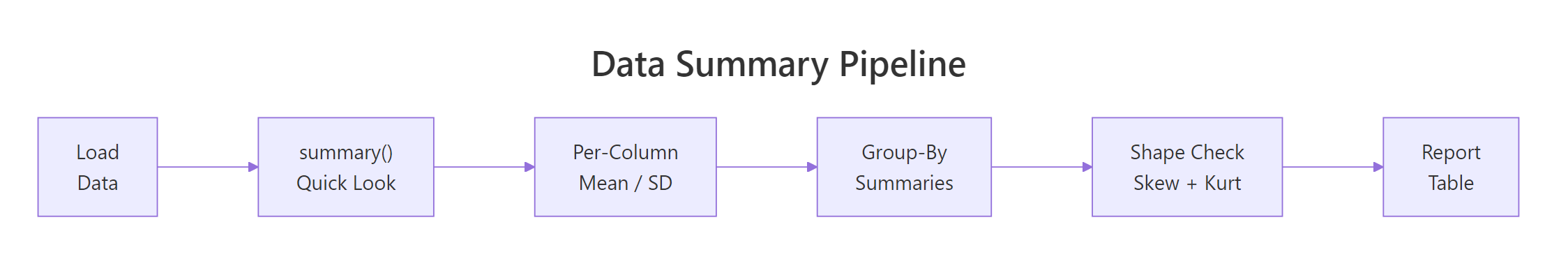
Figure 3: The descriptive statistics pipeline from raw data to report-ready table.

References

  1. R Core Team — An Introduction to R, Chapter 8: Probability distributions. Link
  2. Revelle, W. — psych: Procedures for Psychological, Psychometric, and Personality Research. describe() function reference. Link
  3. Wickham, H. & Grolemund, G. — R for Data Science, 2nd Edition. Chapter 3: Data transformation. Link
  4. dplyr documentation — summarise() reference. Link
  5. NIST/SEMATECH — e-Handbook of Statistical Methods, Section 1.3.5: Measures of Skewness and Kurtosis. Link
  6. Joanes, D.N. & Gill, C.A. (1998) — Comparing measures of sample skewness and kurtosis. The Statistician, 47(1), 183–189.
  7. Bulmer, M.G. (1979) — Principles of Statistics. Dover Publications. Chapters on descriptive measures and distribution shape.

Continue Learning