R Mosaic Plots: See Categorical Patterns That Bar Charts Hide
Mosaic plots visualize the joint distribution of two or more categorical variables as a rectangle recursively split into tiles whose areas are proportional to joint frequencies, making patterns of association immediately visible.
What does a mosaic plot show?
A mosaic plot is the right chart whenever a stacked bar chart would lie about your data. A bar of "first-class passengers" tells you nothing about how many actually survived; a mosaic tile does. Let's draw one for the Titanic.
The plot splits the rectangle vertically by Sex first, then each column horizontally by Survived. Tile areas are proportional to joint counts. The visual answer arrives without reading a single number: women's "Yes" tile is much larger than men's, and men's "No" tile dominates men's column. Sex was the strongest survival predictor on board.
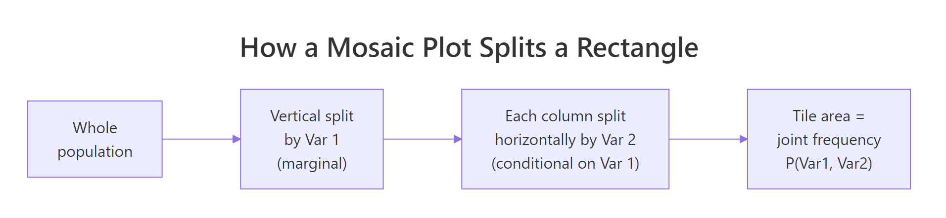
Figure 1: How a mosaic plot recursively splits a rectangle into joint-frequency tiles.
The variable order in the formula controls splitting order. ~ Sex + Survived splits by Sex first (marginal), then by Survived within each sex (conditional). Swap the order and the question changes from "given Sex, what is the survival breakdown?" to "given Survived, what is the sex breakdown?"
Try it: Swap the formula order to ~ Survived + Sex on the same Titanic data. Note how the column widths now reflect overall survival rate.
Click to reveal solution
Explanation: Now the rectangle is first split by Survived (Yes/No), so column widths show the overall survival rate. Within each column, the horizontal split by Sex shows the conditional sex breakdown of survivors and non-survivors. Same data, different question.
How do you build mosaic plots with base R?
Base R ships with mosaicplot() in the graphics package, no extra installs required. It accepts a formula with a contingency table or data frame, lets you control colors and split direction, and handles arbitrary dimensions.
The plot recursively splits the canvas: first by Class (4 columns), then within each class by Sex (rows), then within each Class-Sex cell by Survived (sub-tiles). Reading from left to right reveals patterns the table can't: 1st-class women survived almost universally, while 3rd-class men barely survived at all. The las = 1 argument keeps axis labels horizontal so they stay readable.
Try it: Build a 2-way mosaic for HairEyeColor (Eye + Hair) using base mosaicplot().
Click to reveal solution
Explanation: Setting color = TRUE cycles a default palette across the second variable (Hair). The widest column is Brown eyes (most common in the dataset); the tallest within-column tile usually matches the most common hair color for that eye color.
How do you shade tiles by chi-square residuals?
Base mosaicplot() is functional but plain. For statistical interpretation, the vcd package's mosaic() function adds shading that colors each tile by its Pearson residual, a measure of how far the observed cell count deviates from what independence would predict.
The Pearson residual for cell $(i, j)$ is:
$$r_{ij} = \frac{\text{observed}_{ij} - \text{expected}_{ij}}{\sqrt{\text{expected}_{ij}}}$$
Where:
- $\text{observed}_{ij}$ is the actual cell count.
- $\text{expected}_{ij}$ is the count we would see if the variables were independent: row total × column total / grand total.
Positive residuals (blue tiles) mean over-represented combinations; negative residuals (red tiles) mean under-represented. The deeper the color, the larger the deviation.
The legend on the right maps colors to residual ranges. Look for the deepest blue and deepest red tiles. On the Titanic plot, "1st Class & Survived" lights up dark blue (over-represented vs independence), and "3rd Class & Survived" goes red (under-represented). The chart now functions as a visual chi-square test.
mosaicplot() for quick exploration and presentations. Switch to vcd::mosaic() when you want shading, formal residual calculations, or a publishable diagnostic for an independence test.Try it: Shade a 2-way mosaic of Sex × Class on the Titanic. Identify which Sex-Class combo is most over-represented.
Click to reveal solution
Explanation: "Crew & Male" is the most over-represented (deep blue) cell, reflecting that the crew was almost entirely male. "Crew & Female" is correspondingly the most under-represented.
How do you read mosaic plot residuals statistically?
Shading is exploratory; if you need a formal answer to "are these variables associated?", run chisq.test() and connect the test statistic back to the residual cells you saw.
The chi-square statistic is huge (190.4) with 3 degrees of freedom and a p-value effectively zero, so we reject the null hypothesis of independence. Class and Survived are associated. The mosaic shading already told us where the association lives: 1st-class survivors over-represented, 3rd-class survivors under-represented.
chisq.test() (or its Fisher exact alternative for small cells) is the report-grade conclusion. Use the mosaic to find the story, the test to verify it.Try it: Find the Class-Survived cell with the largest absolute Pearson residual using chi_result$residuals.
Click to reveal solution
Explanation: "3rd Class & No" has the largest residual (7.61), confirming that 3rd-class non-survivors are heavily over-represented relative to independence, which matches the deep red tile in the shaded plot.
Practice Exercises
These exercises combine the ideas above. Use my_* variable names so they don't collide with tutorial variables in the same notebook session.
Exercise 1: Hair and eye color associations
Build a shaded vcd::mosaic for HairEyeColor (Eye × Hair). Identify the Eye-Hair combination with the largest positive residual using chisq.test.
Click to reveal solution
Explanation: Blond hair with Blue eyes is the strongest positive association in the dataset, with a Pearson residual of 7.05. The shaded plot makes this tile the deepest blue.
Exercise 2: Berkeley admissions paradox
The built-in UCBAdmissions dataset records 1973 graduate admissions at Berkeley by department, sex, and admit status. Build a 3-way shaded mosaic of Admit + Gender + Dept. Identify which department most strongly admitted women relative to independence.
Click to reveal solution
Explanation: Department A admitted women at a far higher rate than independence would predict (residual 5.13). The famous Berkeley paradox: aggregate stats showed women admitted less, but department-by-department, women were favored or neutral in most departments. The mosaic surfaces this by stratifying on department first.
Putting It All Together
A worked example from start to finish: load HairEyeColor, draw the marginal sex-collapsed mosaic, shade it, and report the chi-square result.
The plot, the test, and the residuals jointly tell the story: hair and eye color are strongly associated (chi-square = 138.29, p < 2e-16), with Blond-Blue and Black-Brown the strongest positive cells, and Black-Blue and Blond-Brown the strongest negative cells. A bar chart could not show all four signals at once.
Summary
| Takeaway | What it means |
|---|---|
| Mosaic plots show joint distributions | Tile area is proportional to P(Var1, Var2, ...). Wider columns = more cases of Var1; taller within-column tiles = more cases of Var2 given Var1. |
| Formula order controls the question | ~ A + B answers "given A, what is B?". Swap to ask the reverse question. |
| Base mosaicplot() vs vcd::mosaic() | Base is built-in and quick. vcd adds shading by Pearson residuals for statistical reading. |
| Shading is exploratory, chisq.test is confirmatory | Use the colors to find associations, then run chisq.test() for the formal answer. Cells with absolute residuals above 2 are typically reportable. |
| Avoid mosaics for many small cells | When marginal counts are tiny, residuals become noisy and shading misleads. Collapse rare categories first. |
The ggmosaic package offers a geom_mosaic() that integrates with ggplot2 facets and themes if you need consistency with other ggplot charts. It expects tidy data frames and uses aes(x = product(Var1, Var2)) syntax.
References
- Friendly, M., Visualizing Categorical Data. SAS Institute, 2000. The canonical reference on mosaic plots and association graphics. Link
- vcd documentation,
mosaic()reference page on CRAN. Link - R Core Team,
mosaicplot()in the graphics package. R Reference Manual. Link - vcdExtra vignette, Mosaic plots tutorial with extended examples. Link
Continue Learning
- Bivariate EDA in R covers the full toolkit for two-variable exploration including scatter, box, violin, and mosaic plots.
- Chi-Squared Test of Independence in R explains the statistical machinery the mosaic shading visualizes.
- Categorical EDA in R focuses on tools specifically for nominal and ordinal variables.