ggplot2's Grammar of Graphics: The Mental Model That Makes Everything Click
ggplot2's grammar of graphics decomposes every chart into seven independent layers: data, aesthetics, geometries, statistics, scales, coordinates, and themes. You build plots by assembling parts, not memorizing function calls.
Introduction
Most people learn ggplot2 by copying recipes. You find a bar chart example, swap in your data, and tweak until it looks right. That works until you need a chart that isn't in any tutorial. Then you're stuck Googling and guessing.
The grammar of graphics is the mental model that eliminates the guesswork. In 1999, statistician Leland Wilkinson proposed that every statistical graphic can be described by a small set of independent components -- data, transformations, scales, coordinates, and marks. Hadley Wickham adapted this idea into ggplot2's "layered grammar" in 2010, turning it into a practical R package [1].
Once you see ggplot2 as a sentence made of grammatical parts, you stop guessing which function to call. Instead, you compose plots by deciding what each layer should be. The + operator literally stacks these layers on top of each other.
In this tutorial, you will learn the seven layers, how they combine, and when to modify each one. All code runs directly in your browser -- no installation needed. ggplot2 is loaded from the tidyverse, so a single library() call is all you need.
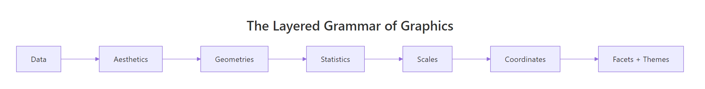
Figure 1: The seven layers of ggplot2's grammar, from raw data to finished plot.
What Are the Seven Layers of the Grammar?
Every ggplot2 plot uses seven layers. Most of the time, ggplot2 fills in sensible defaults so you only specify two or three explicitly. But all seven are always present under the hood.
Here is what each layer controls:
| Layer | ggplot2 function | What it controls |
|---|---|---|
| Data | ggplot(data) |
The dataset to visualize |
| Aesthetics | aes() |
How data columns map to visual properties |
| Geometries | geom_*() |
The visual marks (points, bars, lines) |
| Statistics | stat_*() |
Data transformations before plotting |
| Scales | scale_*() |
How data values translate to visual ranges |
| Coordinates | coord_*() |
The axis system (Cartesian, polar, flipped) |
| Facets + Themes | facet_*(), theme() |
Panel layout and non-data styling |
Let's see all seven layers in a single explicit call. Normally you would let ggplot2 handle the defaults, but writing them out reveals what is happening behind the scenes.
Most of those layers are defaults you never need to type. The minimal version of this plot is just ggplot(mtcars, aes(wt, mpg)) + geom_point(). But knowing all seven exist means you know exactly where to intervene when a plot needs adjustment.
Try it: Take the basic scatterplot above and add a labs() call to set the x-axis label to "Weight (1000 lbs)" and the y-axis label to "Miles per Gallon".
Click to reveal solution
Explanation: labs() sets titles and axis labels. It is part of the theme/annotation layer and overrides the default column-name labels.
How Do Aesthetics Connect Data to Visuals?
Aesthetics are the bridge between your data and what you see on screen. The aes() function maps columns in your data to visual properties like position, colour, size, and shape.
The most common aesthetics are x and y (position), but colour, fill, size, shape, alpha (transparency), and linetype all work the same way. You name the visual property and point it at a column.
Let's start with a basic positional mapping using the mpg dataset (fuel economy for 234 cars).
Each point represents one car. The x-position encodes engine displacement and the y-position encodes highway fuel economy. Larger engines tend to get worse mileage -- you can see the downward trend immediately.
Now let's map additional columns to colour and size. This encodes more information without adding more axes.
SUVs and pickups cluster at high displacement and low mileage. Compact cars cluster at the opposite corner. The colour and size aesthetics made these patterns visible without any extra code.
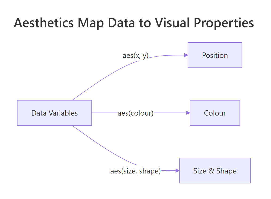
Figure 2: Aesthetics map data variables to visual properties like position, colour, and size.
Try it: Add shape = drv to the aesthetics of the scatterplot above to encode the drivetrain (front, rear, 4wd) as point shapes.
Click to reveal solution
Explanation: Adding shape = drv inside aes() maps the drv column to point shapes. ggplot2 automatically creates a legend for each mapped aesthetic.
How Do Geometries Turn Mapped Data into Shapes?
Geometries (geoms) are the visual marks ggplot2 draws. The same data and aesthetics can look completely different depending on which geom you choose.
Think of it this way: aesthetics say what data to show. Geoms say how to show it. Points, lines, bars, boxplots, and histograms are all different geoms applied to the same grammar.
Let's see the same data rendered with three different geoms.
The scatter plot shows every individual point. It reveals the raw distribution but can suffer from overplotting when points overlap.
The boxplot summarizes each group with a median, quartiles, and whiskers. It is more compact but hides individual observations.
One of ggplot2's most powerful features is layering multiple geoms. You are not limited to one geometry per plot.
The smooth line reveals the overall relationship while the individual points preserve the raw variation. This layering pattern -- raw data plus summary -- is one of the most common in data visualization.
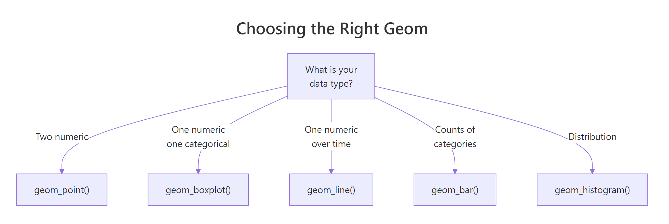
Figure 3: Choosing the right geom based on your data types.
geom_bar() counts rows automatically (stat = "count"). If your data already has y-values, use geom_col() (stat = "identity") instead.Try it: Replace geom_point() with geom_jitter(width = 0.2) in the class vs hwy plot to spread overlapping points.
Click to reveal solution
Explanation: geom_jitter() adds small random noise to point positions. The width argument controls how much horizontal spread is applied. This solves the overplotting problem while keeping individual data points visible.
What Do Scales, Coordinates, and Facets Control?
Scales control how data values translate to visual ranges. Coordinates define the axis system. Facets split your data into panels. These three layers refine and rearrange what the aesthetics and geoms have already set up.
Let's start with scales. Every aesthetic has a default scale, but you can override it to change colours, axis limits, or transformations.
The log scale reveals patterns in the lower price range that a linear scale would squash. The Set2 colour palette improves readability over the default.
Facets are one of the grammar's most powerful ideas. Instead of cramming everything into one plot, you split the data into a grid of smaller panels.
Each panel shows cars with the same cylinder count. The trend lines within each panel tell a different story from the overall trend. Four-cylinder cars show a steep decline in mileage as displacement grows, while eight-cylinder cars cluster tightly.
Try it: Change facet_wrap(~cyl) to facet_grid(drv ~ cyl) to create a 2D panel grid with drivetrain on rows and cylinders on columns.
Click to reveal solution
Explanation: facet_grid(rows ~ cols) creates a matrix of panels. Some cells may be empty if no cars match that combination (e.g., rear-wheel-drive with 4 cylinders). Empty panels are informative -- they show which combinations don't exist.
How Do Themes and Labels Polish a Plot?
Themes control every non-data visual element: background colour, gridlines, font sizes, legend placement, and axis tick formatting. They are the final layer that turns a functional chart into a presentation-ready graphic.
ggplot2 ships with several built-in themes. Let's compare two common ones.
The default grey theme has a grey background with white gridlines. It works well for exploratory analysis.
theme_minimal() strips away the grey background and heavy gridlines, producing a cleaner look suitable for reports and presentations.
For fine-grained control, use theme() to override individual elements. Every part of the plot -- from the title font to the legend background -- is a theme element you can modify.
The title is now bold and 16pt. Minor gridlines are removed to reduce clutter. The legend sits at the bottom, freeing up horizontal space for the plot area.
Try it: Change the legend position to "top" and set the plot background to light blue using theme(panel.background = element_rect(fill = "lightblue")).
Click to reveal solution
Explanation: element_rect(fill = "lightblue") sets the panel background. Every visual element in theme() accepts an element_*() function: element_text() for text, element_rect() for rectangles, element_line() for lines, and element_blank() to remove an element entirely.
Common Mistakes and How to Fix Them
Mistake 1: Forgetting the + between layers
Why it is wrong: Without +, R evaluates ggplot(...) as a complete expression and then tries to run geom_point() on its own. The geom has no plot to attach to.
Mistake 2: Placing aes() arguments outside the function
Why it is wrong: Putting colour = "blue" outside aes() sets a fixed colour for all points. To map colour to a data column, it must be inside aes().
Mistake 3: Using geom_bar() when you already have y-values
Why it is wrong: geom_bar() uses stat = "count" by default. It counts how many rows belong to each x category. If you already have the y-values computed, use geom_col() instead.
Mistake 4: Mapping a continuous variable to shape
Why it is wrong: Shape is a discrete aesthetic. You cannot use it with a continuous variable like hp. Use size or colour for continuous mappings instead.
Practice Exercises
Exercise 1: Build a faceted scatter plot with a custom theme
Create a scatter plot of the mpg dataset with displ on x, hwy on y, coloured by class, faceted by drv, using theme_minimal(). Add a descriptive title and axis labels.
Click to reveal solution
Explanation: The facets split the data by drivetrain type (4wd, front, rear). Each panel has the same axes, making it easy to compare patterns across groups. The colour aesthetic adds a third dimension without extra panels.
Exercise 2: Layer points, smooth line, and text annotations
Using the mtcars dataset, create a scatter plot of wt vs mpg. Add a geom_smooth() trend line. Then use geom_text() to label any car with mpg > 30 (Hint: create a filtered dataset for the text layer).
Click to reveal solution
Explanation: The data argument in geom_text() overrides the global dataset. Only the filtered rows get text labels. The nudge_y argument pushes labels above the points so they don't overlap. This demonstrates the grammar in action: three geoms, each with different purposes, layered on one coordinate system.
Putting It All Together
Let's build a complete, polished visualization from scratch using the grammar of graphics. We will use the mpg dataset to show the relationship between engine size, fuel economy, and vehicle class.
The plan: map displ to x, hwy to y, and colour by class. Then add points, a smooth trend, facet by cylinders, and apply a clean theme with labels.
This 20-line plot demonstrates every layer of the grammar:
- Data --
mpgdataset passed toggplot() - Aesthetics --
displto x,hwyto y,classto colour - Geometries --
geom_point()for raw data,geom_smooth()for trends - Statistics -- the loess smoother transforms data into a trend line
- Scales --
scale_colour_brewer()maps class names to the Dark2 palette - Coordinates -- default Cartesian (no override needed)
- Facets + Theme --
facet_wrap()creates panels,theme_minimal()plus custom overrides clean up the styling
Every decision maps to a specific layer. That is the grammar at work.
Summary
| Layer | Function | What to change |
|---|---|---|
| Data | ggplot(data) |
Switch the dataset |
| Aesthetics | aes(x, y, colour, ...) |
Map different columns to visuals |
| Geometries | geom_point(), geom_bar(), etc. |
Change the visual mark type |
| Statistics | stat_smooth(), stat_count() |
Add computed summaries |
| Scales | scale_colour_*(), scale_y_log10() |
Adjust colour palettes, axis transforms |
| Coordinates | coord_flip(), coord_polar() |
Swap axes or go polar |
| Facets | facet_wrap(), facet_grid() |
Split into panels |
| Themes | theme_minimal(), theme() |
Control fonts, backgrounds, gridlines |
Key takeaways:
- Every ggplot2 plot uses all seven layers, with sensible defaults filling in what you omit
aes()maps data to visuals. Geoms turn those mappings into shapes on screen- Layering multiple geoms (e.g., points + smooth) is a core ggplot2 pattern
- Facets create small multiples that reveal subgroup patterns
- Start with a built-in theme and override specific elements with
theme()
FAQ
What is the difference between aes() inside ggplot() vs inside geom_*()?
Aesthetics defined in ggplot(aes(...)) apply globally to every layer. Aesthetics defined in geom_point(aes(...)) apply only to that specific geom. Use global aesthetics when all layers share the same mapping. Use layer-specific aesthetics when one geom needs a different mapping -- for example, a text layer that maps a label column.
Why does ggplot2 use + instead of the pipe |> to add layers?
ggplot2 was created in 2007, years before R had a pipe operator. The + operator works because ggplot() returns a ggplot object, and + is overloaded to add layers to that object. Changing to |> would break millions of existing scripts, so + remains the standard.
Can I mix base R graphics with ggplot2?
No. Base R graphics (like plot(), hist(), lines()) and ggplot2 use completely different rendering systems. They cannot share the same plotting device in a meaningful way. Pick one system per plot.
How many geom layers can I stack on one plot?
There is no hard limit. In practice, 2-4 geom layers work well. Beyond that, the plot becomes cluttered. If you need more, consider faceting instead of layering.
When should I use stat_() instead of geom_()?
Every geom has a default stat, and every stat has a default geom. Use stat_*() when you want a statistical transformation that isn't the default for any common geom. For example, stat_ecdf() computes the empirical cumulative distribution function. For most use cases, specifying the geom and letting its default stat do the work is simpler.
References
- Wickham, H. -- "A Layered Grammar of Graphics." Journal of Computational and Graphical Statistics, 19(1), 3-28 (2010). Link
- Wilkinson, L. -- The Grammar of Graphics, 2nd ed. Springer (2005).
- Wickham, H. -- ggplot2: Elegant Graphics for Data Analysis, 3rd ed. Link
- ggplot2 official documentation. Link
- Wickham, H. & Grolemund, G. -- R for Data Science, 2nd ed. Chapter 2: Data Visualization. Link
- RStudio -- ggplot2 Cheat Sheet. Link
- Wilke, C. -- Fundamentals of Data Visualization. Link
Continue Learning
- ggplot2 Tutorial -- A hands-on walkthrough building common chart types with ggplot2
- ggplot2 Tutorial Part 1: Introduction -- Deeper ggplot2 examples covering scatterplots, bar charts, and histograms
- ggplot2 Tutorial Part 2: Themes -- Advanced theme customization and styling