t-SNE and UMAP in R: Compress High-Dimensional Data to 2D, Without Losing Clusters
t-SNE and UMAP are nonlinear dimensionality-reduction methods that turn a table with dozens of columns into a 2D map where points close together in the original space stay close together on the page. Use them when PCA leaves your clusters overlapping and you need a map good enough to eyeball.
What do t-SNE and UMAP actually do?
Picture the iris dataset: four measurements per flower, three species. PCA draws a straight 2D shadow of that 4D cloud, which works when groups separate along straight lines. t-SNE and UMAP do something subtler: they ask, for every pair of points, how similar are you in the full space? and then place those points on a 2D canvas so similar ones land near each other. Non-linearities stop being a problem. One line of code shows the payoff.
Four columns of numbers turned into three visually distinct flower groups. Nothing about the species labels entered the calculation. t-SNE only saw the measurements, yet the picture shows what a botanist already knows: setosa is different, versicolor and virginica are closer but still distinguishable. That is what "preserving neighbor structure" buys you.
The mental model is simple. For every point, t-SNE and UMAP list its nearest neighbors in the high-dimensional space. Then they place points on a 2D canvas and nudge them until every point's list of 2D neighbors roughly matches its original list. Unrelated points are allowed to drift to whatever position the optimizer finds convenient. That is why these plots are useful for spotting clusters and useless for measuring the distance between clusters.
Before any of this works, there's a small but critical data-prep step: you need to put every column on the same scale. Both algorithms measure point-to-point similarity with Euclidean distance, so a feature in thousands will drown a feature in tenths. scale() centers and standardizes each column, which lets every feature contribute fairly to the neighbor calculation.
scale() is the top cause of confusing plots, especially when your columns mix units (price in dollars next to weight in grams next to a 0-1 ratio).Try it: Run t-SNE on the numeric columns of mtcars, colored by cylinder count.
Click to reveal solution
Explanation: perplexity=10 is lower because mtcars has only 32 rows, and the default 30 is larger than the sample size (Rtsne would refuse to run). Smaller datasets want smaller perplexity.
How do you run t-SNE in R with Rtsne?
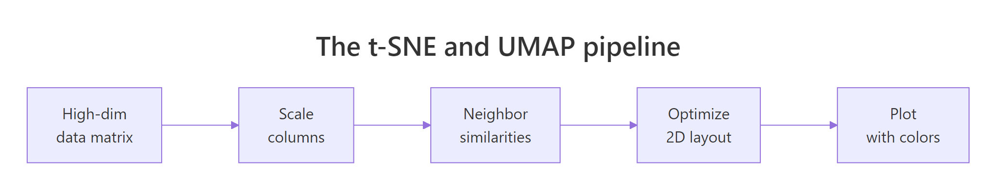
Figure 1: The shared pipeline: scale, compute neighbor similarities, optimize a 2D layout, plot.
The Rtsne package wraps Laurens van der Maaten's Barnes-Hut t-SNE implementation. Its key arguments:
X: the scaled numeric matrix or data framedims = 2: output dimensions (almost always 2)perplexity = 30: effective neighborhood size (typical range 5 to 50)max_iter = 1000: optimizer iterationsverbose = TRUE: print progress
Perplexity is the one knob that changes your plot. It controls how many neighbors each point "feels" during the optimization. Low perplexity makes t-SNE focus on tight local groups. High perplexity pulls in broader context. Let's rerun with perplexity 15 and see the difference.
The three clouds are still there, but the gap between versicolor and virginica widened. Smaller perplexity = more local focus = more aggressive cluster separation. That can be good (real sub-groups pop out) or bad (noise looks like sub-groups). You must eyeball several values to know which.
Try it: Re-run t-SNE with perplexity = 5 and describe the visual change versus perplexity = 30.
Click to reveal solution
Explanation: With perplexity 5, t-SNE only considers each point's 5 closest neighbors. Real clusters shatter into sub-blobs because any local variation gets amplified. This is the classic "perplexity too low" look.
How do you run UMAP in R with the umap package?
UMAP, by McInnes, Healy and Melville (2018), joined the toolbox a decade after t-SNE. It optimizes a different objective, runs faster, and tends to preserve more of the global structure. Two R packages implement it: umap (pure R, easy install) and uwot (Rcpp, faster). The code below uses umap because it runs in-browser. The API of the two is deliberately similar.
UMAP's output looks tighter than t-SNE's. Points inside a cluster collapse toward a single "blob" while the three blobs drift apart. That is a consequence of the min_dist parameter (how close neighbors are allowed to sit) and UMAP's cost function, which penalizes far-apart neighbors and far-apart non-neighbors symmetrically.
Seeing both methods side-by-side is the fastest way to build intuition. We'll use patchwork to stitch them together.
Same data, same seed family, same colors. The two plots tell the same story (three clear species) with different visual emphasis. UMAP paints compact, island-like clusters; t-SNE paints soft, diffuse ones. Neither is wrong. Which one you prefer depends on whether you want to eyeball small-scale sub-structure (t-SNE) or big-picture layout (UMAP).
library(uwot); umap(iris_scaled) gives a near-identical API and runs much faster on large data. The in-browser sample on this page uses the pure-R umap package because uwot ships only as a compiled binary. Swap in uwot::umap() in your local R session.Try it: Re-run umap::umap with n_neighbors = 30 and plot the result.
Click to reveal solution
Explanation: Larger n_neighbors means each point considers a wider context. Global structure (setosa being off on its own) gets slightly muted; cluster boundaries blur a little. This is the UMAP equivalent of raising t-SNE's perplexity.
How do perplexity and n_neighbors change the picture?
Both parameters are versions of the same question: how big is a local neighborhood? Small values make the algorithm focus on very local structure, so real clusters shatter into fragments. Large values pull in broader context, so real clusters merge. The "right" value is whatever makes the plot show what the data actually contains, and you learn that by trying several.
A grid is the fastest way. Below, we run Rtsne four times at perplexity 5, 15, 30, 50 and plot all four.
Perplexity 5 fragments virginica into mini-blobs that aren't real sub-species. Perplexity 50 smooths everything into three clean globs. Perplexity 15 and 30 sit between them and show the same story. That's the zone to settle on for this dataset. Reporting just one perplexity without trying others is a common beginner mistake.
The same game with UMAP's n_neighbors:
Same pattern as t-SNE, different tuning name. UMAP with n_neighbors = 5 fragments the clusters; with n_neighbors = 50 it softens them. The middle values hit the right balance. min_dist is a secondary knob that controls how tightly points are packed inside a cluster; try 0.01 for crisp blobs and 0.5 for loose clouds.
Try it: Run UMAP on iris twice with min_dist = 0.01 and min_dist = 0.5 and describe the change.
Click to reveal solution
Explanation: min_dist is the minimum distance UMAP allows between neighboring points in the 2D layout. Smaller = tighter clusters. Use small values for clear visual separation; larger values when you want to see point density inside clusters.
When should you trust the 2D layout, and when should you not?
Three traps catch readers who take these plots too literally. The first is seed sensitivity. t-SNE initializes the 2D layout randomly and descends a non-convex objective. Different random seeds reach different minima. Same data, same parameters, different pictures.
The clusters survive (good: that tells you they're real). But their shapes, rotations and relative positions change. That is the signal you need: only the cluster membership is robust; everything else is artifact.
The second trap is harder to catch: cluster sizes and inter-cluster gaps on the page don't mean what you think. t-SNE's cost function equalizes cluster density, so a tight cluster of 200 points and a loose cluster of 10 points can appear the same size in the 2D plot. Here's a minimal demo.
In the raw data, the loose blob has 50x the spread of the tight one. On the t-SNE page, they look similar. If you'd made decisions based on visual cluster diameter, you'd be wrong by a factor of 50. UMAP is slightly better here but has the same general failure mode.
Both pitfalls above share a cause. These methods are built to reveal who is near whom, not to quantify anything else. So the moment you start reading "the red cluster is twice as wide as the blue one" off a t-SNE plot, you have exited the range where the method's output means what you think it means.
The useful posture is to treat every t-SNE or UMAP plot as a hypothesis generator, never an answer. It suggests "there might be three groups here, and point X looks like it belongs with the red group." You then go back to the original numeric data and test that suggestion with a real clustering algorithm or a statistical test.
Try it: Run Rtsne twice with seeds 10 and 99 on iris, then verify that the first point has different coordinates across the two runs.
Click to reveal solution
Explanation: The coordinates differ because the algorithm converges to different local minima of a non-convex objective. The cluster memberships are typically stable; the positions are not.
When should you pick t-SNE vs UMAP?
The two methods solve the same problem with different trade-offs. Most projects can use either; the differences matter at the margins.
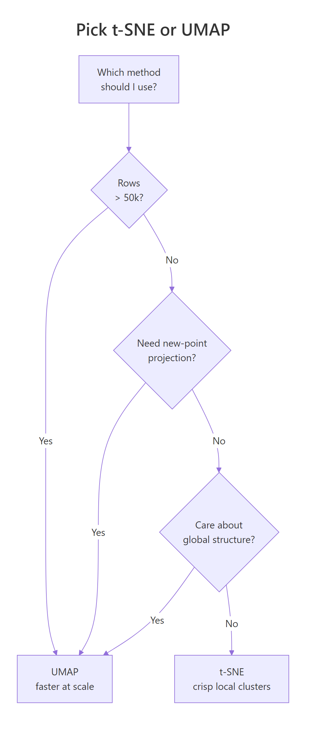
Figure 2: A quick decision guide for choosing between t-SNE and UMAP.
Speed is the first lever. UMAP scales roughly linearly in sample size; Barnes-Hut t-SNE scales O(n log n) but with a much larger constant. On a few thousand rows they feel identical. On tens of thousands, UMAP is faster. On hundreds of thousands, t-SNE becomes painful.
At 1,000 rows and 30 columns, the two methods finish in comparable time. Scale this to 50,000 rows and UMAP wins by 10x or more. That's the first reason UMAP took over in biology and single-cell genomics: practitioners there routinely embed 100k+ points.
The second lever is global structure. UMAP's cost function pushes unrelated points apart more aggressively, so the large-scale layout (which cluster is near which) is more trustworthy than t-SNE's. t-SNE's strength is the opposite: it over-separates clusters, which looks clean but can exaggerate real gaps.
| Question | t-SNE (Rtsne) | UMAP (umap / uwot) |
|---|---|---|
| Speed on 50k rows | Slow (minutes) | Fast (seconds) |
| Global structure | Often distorted | Better preserved |
| Key knob | perplexity (5 to 50) |
n_neighbors (5 to 50) |
| Seed reproducibility | set.seed() works |
set.seed() works |
| Project new points | Not supported | uwot::umap_transform() |
| Output "look" | Soft, diffuse clouds | Compact island blobs |
Try it: Use system.time() to time Rtsne and umap on a 300-row synthetic matrix. Which finished first?
Click to reveal solution
Explanation: On small data, both methods are fast enough that the choice is cosmetic. The speed gap opens as n grows.
Practice Exercises
Exercise 1: Embed the attitude dataset
Scale the built-in attitude data set (30 rows, 7 columns of survey ratings), run Rtsne with perplexity = 7, run umap::umap with n_neighbors = 7, and plot both side by side. Save the side-by-side plot to my_att_plot.
Click to reveal solution
Explanation: perplexity = 7 and n_neighbors = 7 are both below the default because attitude has only 30 rows. Rtsne requires 3 * perplexity < n - 1, so anything above 9 would error.
Exercise 2: Unified embedding function
Write a function embed_2d(mat, method = c("tsne","umap")) that scales the matrix internally, runs the chosen method, and returns a data frame with columns x, y, method. Then call it twice on iris[, 1:4] (once for each method), bind the results, and facet-plot the two embeddings.
Click to reveal solution
Explanation: match.arg() validates the method argument against the allowed values, so a typo fails fast. Wrapping both methods behind a single function keeps downstream plotting code identical.
Complete Example
A 500-row sample of the diamonds dataset has seven numeric columns (carat, depth, table, price, x, y, z) plus a cut label with five levels. We want to see whether the numeric features alone carry enough signal to separate diamonds by cut quality.
This is a useful negative result. The numeric features of a diamond (size, price, shape) do not carry enough information to separate diamonds by cut quality. The cut label is mostly orthogonal to those numeric columns. If your plot looks like this, with points thoroughly mixed by color, the conclusion is that the features you used don't explain the label you colored by, not that t-SNE or UMAP failed. That interpretation check is the most valuable part of running these embeddings.
Summary
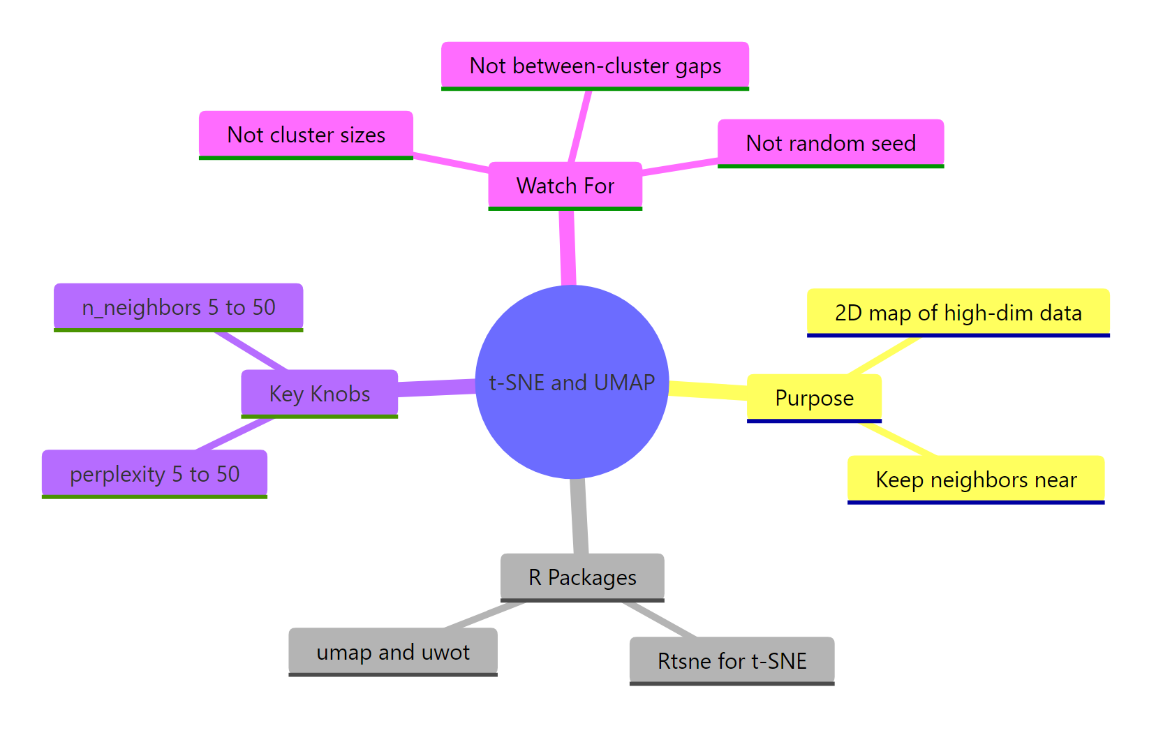
Figure 3: Overview of what both methods do, their key knobs, and common traps.
| Question | t-SNE (Rtsne) | UMAP (umap / uwot) |
|---|---|---|
| What's the R call? | Rtsne(x, perplexity = 30) |
umap::umap(x, n_neighbors = 15) |
| Main knob | perplexity (5 to 50) |
n_neighbors (5 to 50) |
| Secondary knob | max_iter, theta |
min_dist, metric |
| Global structure | Often distorted | Better preserved |
| Speed on large n | Slower | Faster |
| Seed behavior | Stochastic, fix with set.seed() |
Stochastic, fix with set.seed() |
| New-point projection | Not supported | uwot::umap_transform() |
| Good default for n < 5k | Either works | Either works |
| Good default for n > 50k | Avoid | Prefer |
Rules of thumb to keep:
- Always
scale()the columns first. - Always
set.seed()before the call, and try 2 to 3 seeds. - Always try 3 to 5 values of the main knob (perplexity or n_neighbors).
- Never interpret cluster sizes or inter-cluster distances as meaningful.
- Confirm any cluster story with a separate method on the raw data.
References
- Van der Maaten, L. & Hinton, G. (2008). Visualizing Data using t-SNE. Journal of Machine Learning Research, 9: 2579-2605. PDF
- McInnes, L., Healy, J., & Melville, J. (2018). UMAP: Uniform Manifold Approximation and Projection for Dimension Reduction. arXiv:1802.03426. Link
- Krijthe, J. H. Rtsne: R wrapper for Barnes-Hut t-SNE. GitHub
- Konopka, T. umap package on CRAN. Link
- Melville, J. uwot package: R implementation of UMAP. GitHub
- Wattenberg, M., Viégas, F., & Johnson, I. (2016). How to Use t-SNE Effectively. Distill. Link
- Coenen, A. & Pearce, A. Understanding UMAP. Google PAIR. Link
Continue Learning
- PCA with prcomp(): the linear sibling of these methods; always start there before reaching for a nonlinear embedding.
- Clustering in R: k-Means, Hierarchical, DBSCAN: once the embedding suggests groups, confirm them with a clustering algorithm on the raw data.
- Linear Discriminant Analysis in R: the supervised alternative when you already know the labels and want to maximize class separation.