Weibull, Log-Normal & Uniform Distributions in R: Survival & Reliability
The Weibull distribution models time-to-failure and survival data, the log-normal distribution captures multiplicative processes like incomes and file sizes, and the uniform distribution assigns equal probability to every value in a range, making it the workhorse of Monte Carlo simulation. Together they cover the three most common shapes you meet outside the Gaussian family.
When should you use Weibull, log-normal, or uniform distributions?
These three distributions anchor three different worlds. Weibull owns survival and reliability, anything with a failure rate that changes over time. Log-normal owns multiplicative growth, incomes, file sizes, stock returns, reaction times. Uniform owns pure ignorance, every outcome in a range equally likely, which is why it powers Monte Carlo simulation. Here are their shapes side by side so you can recognise each one on sight.
The code below loads ggplot2, tibble, and dplyr, builds a grid of x-values, computes each distribution's density at comparable parameter settings, and plots all three on one chart with coloured lines.
The Weibull curve rises to a peak near its scale and falls away, a finite mode and a lightish right tail. The log-normal rises faster on the left but trails off more slowly on the right, that long tail is the giveaway for multiplicative data. The uniform is a flat rectangle between 0 and 3 with height 1/3. One glance tells you which family your data resembles.
dweibull/pweibull/qweibull/rweibull, dlnorm/plnorm/qlnorm/rlnorm, and dunif/punif/qunif/runif mirror dnorm/pnorm/qnorm/rnorm, density, CDF, quantile, and random sampler. Once you learn the pattern for one, you know it for all of them.Try it: Re-plot the three densities with the uniform set to min = 0, max = 10 instead of (0, 3). What happens to the height of the rectangle, and why?
Click to reveal solution
Explanation: A uniform density integrates to 1 over its support, so stretching the range from width 3 to width 10 drops the height from 1/3 ≈ 0.33 to 1/10 = 0.1.
How does the Weibull distribution model survival and reliability?
The Weibull distribution is the default choice for time-to-failure data, light bulbs, bearings, hard drives, insurance policy cancellations. It has two parameters: a shape k and a scale lambda. The shape controls whether items fail more often as they age, at a constant rate, or less often (a "burn-in" period). The scale sets the characteristic lifetime, roughly the point where about 63% of items have failed.
Let's plot three Weibull densities at shape values 0.5, 1, and 3 with scale fixed at 1. Watch how the whole curve morphs from an exponential-looking decay to a near-bell shape.
The shape parameter completely reorganises the distribution. At k = 1, Weibull collapses to the exponential, memoryless, constant hazard. At k > 1, older items fail faster than young ones (wear-out). At k < 1, new items fail faster (infant mortality). The same two parameters describe three very different failure regimes, which is why engineers love it.
The failure-rate story is clearer when you plot the hazard function directly. The hazard at time t is the instantaneous failure rate given survival up to t:
$$h(t) = \frac{f(t)}{1 - F(t)} = \frac{k}{\lambda}\left(\frac{t}{\lambda}\right)^{k-1}$$
Where:
- $h(t)$ = instantaneous failure rate at time $t$
- $f(t)$ = Weibull density (what
dweibull()returns) - $F(t)$ = Weibull CDF (what
pweibull()returns) - $k, \lambda$ = shape and scale parameters
In R we can compute it directly from the d/p functions.
Each curve corresponds to one of the three segments of the classic "bathtub" reliability curve: infant mortality, useful life, and wear-out. Real products often exhibit all three over their lifespan, which is why reliability engineers sometimes fit a mixture of Weibulls instead of a single one.
k > 1. If falling, k < 1. If flat, the Weibull reduces to an exponential. That one parameter is the difference between a bearing that wears out and a transistor that fails at random.Now let's simulate 500 failure times from a Weibull with shape = 2, scale = 1000 (a typical "wear-out" device with characteristic life of 1000 hours) and compare the sample mean and median to the theoretical values.
The sample estimates come within 2% of the analytical values, exactly what we expect from 500 draws. Notice the mean is slightly above the median (reflecting the right skew) and qweibull(0.5, ...) gives the theoretical median directly. That one line replaces any analytical manipulation of log(2)^(1/k) * lambda.
Try it: Compute the 90th percentile of time-to-failure for a Weibull with shape = 2 and scale = 1000, the time by which 90% of items will have failed.
Click to reveal solution
Explanation: qweibull(p, shape, scale) returns the value t such that P(T <= t) = p. Reliability engineers call this the B_p life, B10 for 10%, B90 for 90%, and so on.
How does the log-normal distribution arise from multiplicative processes?
The log-normal distribution is what you get when you multiply many small independent positive shocks together. Formally, if log(X) ~ Normal(meanlog, sdlog), then X ~ LogNormal(meanlog, sdlog). The meanlog and sdlog parameters are parameters of log(X), not of X, a confusion that bites almost everyone on first contact.
The cleanest demonstration is to simulate a multiplicative growth process and watch the distribution of final values. Imagine 5,000 parallel "stocks", each compounded by small random monthly returns for 60 months. The final values should be log-normal.
The red density sits on top of the histogram because the Central Limit Theorem guarantees that sums of many small independent shocks, the cumsum, are approximately normal, so their exponentials (the final values) are approximately log-normal. Anything that compounds multiplicatively, investments, populations, reaction times, belongs to this family.
Now let's use dlnorm and plnorm for the classic income question: if log-income has mean 10.5 and sd 0.7 (so typical income is around exp(10.5) ≈ 36,000), what fraction of the population earns more than 100,000?
About 8% of the population earns above 100k, the median is 36,315, and the mean is 46,380. The gap between mean and median, the mean is 28% higher, is the statistical signature of the long right tail. Reporting only the mean would overstate the typical experience, which is why household income is almost always summarised by the median.
exp(meanlog) and the mean equals exp(meanlog + sdlog²/2), that extra sdlog²/2 term pushes the mean up whenever there's any spread at all. This is exactly why average wealth is so much higher than median wealth: the top tail pulls the mean.Try it: Take 2000 samples from rlnorm(meanlog = 1, sdlog = 0.5) and check visually whether log() of those samples looks normal, using a QQ plot against the theoretical normal.
Click to reveal solution
Explanation: The defining property of log-normal is that the logarithm is normal. A QQ plot of log(X) against the standard normal should be a straight line; deviations suggest a different family.
What makes the uniform distribution the backbone of Monte Carlo simulation?
The uniform distribution on [min, max] assigns equal probability density 1 / (max - min) to every point in its range and zero outside. It's the simplest continuous distribution, and also the most important in computing, because almost every random number generator in every language produces uniform numbers first and transforms them into everything else.
Here's the d/p/q/r tour on Uniform(0, 10).
Four lines give you density, cumulative probability, quantile, and random draws. dunif returns 1/10 = 0.1 everywhere in range. punif(3) returns 0.3 because 3 is 30% of the way from 0 to 10. qunif(0.75) inverts that: the 75th percentile of Uniform(0, 10) is 7.5. And runif(5) draws five samples.
set.seed(N) before runif() (or any r-function) so results are reproducible and bugs are easier to spot. The argument is any integer, distinct seeds per major simulation keep parallel runs independent.The deeper reason the uniform matters is inverse-transform sampling: if U ~ Uniform(0, 1) and F is any continuous CDF, then F^(-1)(U) follows the distribution with CDF F. You can generate any distribution you want from uniform draws. Let's demonstrate with the exponential, whose inverse CDF is -log(1 - u) / rate.
The QQ plot sits right on the diagonal, confirming both methods produce samples from the same exponential distribution. That single identity, F^(-1)(U), is how R, Python, C, and every other language generate Weibull, log-normal, gamma, beta, and dozens more distributions under the hood. The uniform is the engine.
Try it: Estimate π using 20,000 uniform draws in the unit square via the classic Monte Carlo method, count the fraction falling inside the quarter-circle of radius 1 and multiply by 4.
Click to reveal solution
Explanation: A quarter-circle of radius 1 has area pi / 4. The fraction of uniform points in the unit square falling inside it estimates that area, so multiplying by 4 estimates pi. The error shrinks as 1 / sqrt(n), 20,000 draws typically get two correct decimals.
How do you choose between Weibull, log-normal, and uniform for your data?
The three distributions answer different questions, so the first step is to frame the problem, not to look at the histogram. Use this flow:
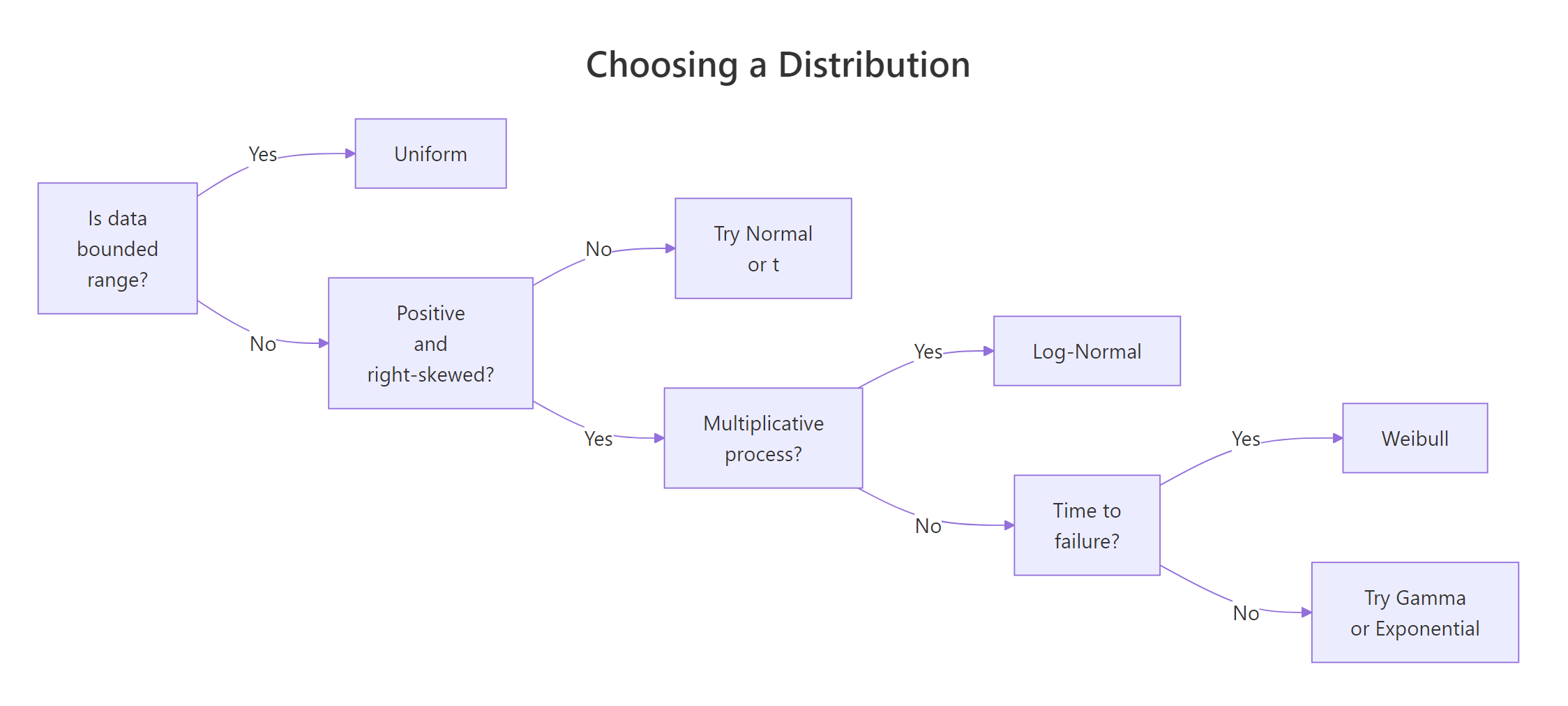
Figure 1: Deciding which distribution fits your data.
And this cheat-sheet of visual and domain cues:
| Cue | Weibull | Log-Normal | Uniform |
|---|---|---|---|
| Typical domain | Time to failure, survival | Income, file size, reaction time | Bounded measurement, Monte Carlo input |
| Support | (0, ∞) |
(0, ∞) |
[min, max] |
| Shape | Can be skewed or bell-like | Always right-skewed | Flat |
| Key parameter | shape (hazard direction) |
sdlog (tail heaviness) |
min, max (range) |
| Mean vs median | Mean > median if k < 3.6 | Mean always > median | Mean = median |
| d/p/q/r | dweibull family |
dlnorm family |
dunif family |
When you're unsure, fit all three and compare log-likelihoods. Here's how to do that using method-of-moments estimators on a synthetic right-skewed dataset, simple, transparent, and fast.
The Weibull log-likelihood is the highest (least negative), log-normal is a close second, and uniform trails badly, expected, because we generated the data from a Weibull. Higher log-likelihood means better fit, so this simple comparison tells you which family to trust. For a real analysis you would also check goodness-of-fit with a Kolmogorov–Smirnov test or a QQ plot per candidate.
dlnorm(..., meanlog = mean(x), sdlog = sd(x)) is a classic bug, you need mean(log(x)) and sd(log(x)). Mentally rename the arguments as log_mean and log_sd to avoid the slip.Try it: Generate 200 samples from Weibull(shape = 2, scale = 10), fit a log-normal to them via method-of-moments, and print the log-likelihood ratio vs the true Weibull fit.
Click to reveal solution
Explanation: Log-normal's tail is heavier than Weibull's, so the fit concentrates mass in the wrong place and the log-likelihood drops noticeably below what you'd see from a correctly specified Weibull. A likelihood-ratio test would formalise this gap.
Practice Exercises
Exercise 1: Pump reliability study
You have 25 observed failure times (hours) of industrial pumps. Fit a Weibull by method-of-moments and compute the probability that a fresh pump survives past 2,000 hours.
Click to reveal solution
Explanation: The moment equation relates the coefficient of variation m2 / m1^2 to the shape parameter through gamma functions. Once shape is solved, scale follows from the mean identity. About 29% of pumps survive past 2,000 hours under this fitted model.
Exercise 2: Log-normal growth path
Simulate a single 100-step path where monthly log-returns follow Normal(0, 0.02). Compute the 5th and 95th percentile of the final value analytically from the implied log-normal distribution (no need to simulate many paths).
Click to reveal solution
Explanation: Summing 100 iid log-returns with sd 0.02 produces a log-return with sd 0.02 * sqrt(100) = 0.2. So the final value is LogNormal(0, 0.2). The 5th and 95th percentiles are found directly with qlnorm, giving an 80% interval of roughly (0.72, 1.39), a 28% downside and a 39% upside from starting wealth.
Exercise 3: Monte Carlo integration
Use 50,000 uniform draws to estimate the integral of sin(x^2) from 0 to 1, and report a 95% confidence interval around the estimate.
Click to reveal solution
Explanation: For U ~ Uniform(0, 1), E[f(U)] equals the integral of f on [0, 1]. So the sample mean of sin(U^2) is an unbiased estimator of the integral, and its standard error is sd / sqrt(n). The true value is about 0.3103, inside our 95% interval.
Complete Example: Lightbulb reliability mini-study
Let's tie everything together with a reliability engineer's workflow: simulate realistic lightbulb lifetimes, fit a Weibull, and estimate two quantities the business cares about, Mean Time To Failure (MTTF) and the B10 life (the age by which 10% of bulbs have failed).
The fitted shape (2.49) and scale (8,073) are within 1% of the true values we simulated from, expected, because method-of-moments on 500 observations is accurate for a well-behaved Weibull. The MTTF of ~7,165 hours says the average bulb lasts about 7,000 hours, while the B10 life of ~2,867 hours is the warranty number: one in ten bulbs fails before this point. The empirical and fitted survival curves overlap almost perfectly, giving visual confirmation that the Weibull model is appropriate.
Summary
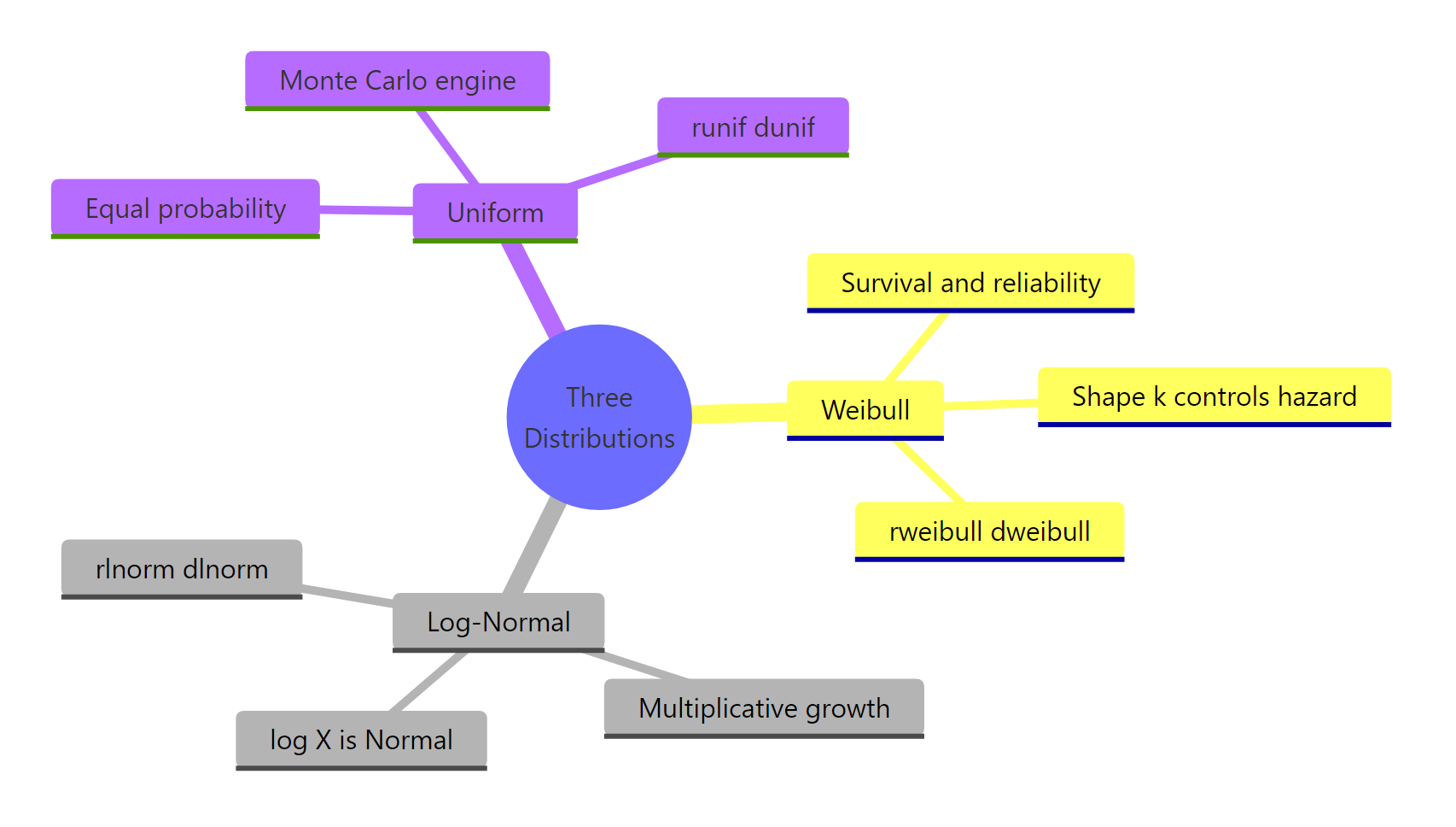
Figure 2: The three distributions at a glance.
| Property | Weibull | Log-Normal | Uniform |
|---|---|---|---|
| Use for | Time to failure | Multiplicative processes | Bounded ignorance, Monte Carlo |
| Support | (0, ∞) |
(0, ∞) |
[min, max] |
| Key parameters | shape, scale |
meanlog, sdlog |
min, max |
| d/p/q/r functions | dweibull, etc. |
dlnorm, etc. |
dunif, etc. |
| Mean | scale * Gamma(1 + 1/shape) |
exp(meanlog + sdlog^2 / 2) |
(min + max) / 2 |
| Median | scale * (ln 2)^(1/shape) |
exp(meanlog) |
(min + max) / 2 |
| Mean vs median | Usually mean > median | Always mean > median | Equal |
| Typical pitfall | Confusing shape with scale | meanlog is on the log scale |
Forgetting set.seed() |
References
- R Core Team, The Weibull Distribution. R stats package documentation. Link
- R Core Team, The Log Normal Distribution. R stats package documentation. Link
- R Core Team, The Uniform Distribution. R stats package documentation. Link
- Weibull, W. (1951), A Statistical Distribution Function of Wide Applicability. Journal of Applied Mechanics, 18, 293–297.
- Crow, E. L. & Shimizu, K. (1988), Lognormal Distributions: Theory and Applications. Marcel Dekker.
- Devroye, L. (1986), Non-Uniform Random Variate Generation, Chapter II (Inverse-Transform Method). Springer. Link
Continue Learning
- Normal, t, F & Chi-Squared Distributions in R, the four classical families that sit alongside these three.
- Gamma & Beta Distributions in R: Shape, Scale & Conjugate Priors, two more right-skewed distributions with close mathematical ties to Weibull.
- The Exponential Distribution in R, the
k = 1special case of Weibull, and the building block for Poisson and queueing models.