Fitting Distributions to Data in R: fitdistrplus Step-by-Step Tutorial
You have data and you want to know which probability distribution it came from. The fitdistrplus package answers that by fitting candidate distributions, running goodness-of-fit checks, and producing diagnostic plots that let you compare fits side by side.
How do you fit a distribution to data in R with fitdistrplus?
Start with the simplest case: a column of positive continuous numbers. The groundbeef dataset that ships with the package records serving sizes in grams for 254 ground-beef patties. Suppose you suspect the data is gamma-distributed. A single call to fitdist() estimates the parameters by maximum likelihood and returns everything you need to judge the fit.
One line and you have two parameter estimates (shape = 1.63, rate = 0.022), their standard errors, the log-likelihood, and the information criteria (AIC / BIC). The AIC value only becomes meaningful when you compare it across competing distributions, a task we tackle in section 4.
With the fit object in hand, the next question is always does it actually fit? That's what the plot method answers.
The call draws four panels: a histogram with the fitted density on top, the empirical CDF next to the theoretical CDF, a Q-Q plot, and a P-P plot. The density and CDF panels answer does the shape look right? The Q-Q and P-P plots answer are the tails okay? If points hug the diagonal line in Q-Q / P-P plots across the full range, the distribution is a good match. Systematic curvature signals a mismatch, especially in the tails where it matters most.
dmydist(), pmydist(), qmydist() for.Try it: Fit a Weibull distribution to the same serving vector and store it in ex_fw. Print its summary.
Click to reveal solution
Explanation: Only the distribution name changes, fitdist() does the rest. The Weibull AIC (2515.3) is slightly higher than the gamma's (2512.4), but the gap is small enough that the full comparison in section 4 is needed before declaring a winner.
How do you choose which distributions to try first?
Guessing a distribution is wasteful when a 20-line plot can narrow the candidates for you. The skewness–kurtosis plot proposed by Cullen & Frey (1999) places your data as a single point on a plane where common distributions occupy known positions: the normal sits at one point, the uniform at another, the logistic at a third, the exponential at a fourth; lognormal and gamma each occupy a curve; the beta family fills an entire region.
The function descdist() computes the sample skewness and kurtosis, plots the point, and optionally adds a bootstrap cloud so you can see how stable the pick is.
The observation (0.74 skew, 3.29 kurtosis) lands near the gamma and lognormal curves. That is exactly why gamma, Weibull, and lognormal are the three standard candidates for positive right-skewed continuous data.
Try it: Run descdist() on log(serving) with 300 bootstrap replicates. Where does the bootstrap cloud land relative to the Normal point?
Click to reveal solution
Explanation: The cloud now lands near the Normal reference point, confirming that serving is roughly lognormal on the original scale. Log-transform data often becomes approximately normal when the raw data is lognormal.
Which parameter-estimation method should you use?
fitdist() defaults to maximum likelihood (method = "mle"), but the package supports three alternatives:
- MME, Method of Moments Estimation matches the sample mean and variance to the distribution's theoretical moments.
- QME, Quantile Matching Estimation matches chosen sample percentiles (e.g. the 25th and 75th) to the distribution's theoretical quantiles.
- MGE, Maximum Goodness-of-fit Estimation minimises a chosen distance (KS, CvM, or AD) between the empirical and theoretical CDFs.
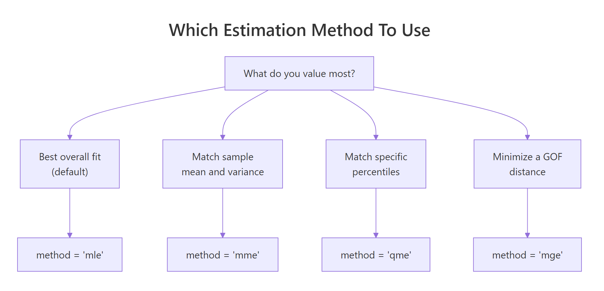
Figure 1: Pick the estimation method that matches what you most want to match.
Most of the time MLE is the right default, it is statistically efficient and gives you standard errors. The alternatives earn their keep in specific situations. MME is fast and closed-form for many families, handy when MLE's optimiser struggles with pathological data. QME is useful when you specifically care about fit at certain percentiles (risk modelling, reliability). MGE is appropriate when you plan to evaluate fits by a specific distance anyway.
Here are MLE and MME side by side on the gamma fit:
The two methods disagree because the sample's first two moments don't perfectly pin down a gamma. MLE weights every observation via the likelihood; MME only uses the mean and variance. When the data is actually gamma, both converge. When it isn't, MLE usually gives the more reliable fit.
Quantile matching looks similar but constrains specific percentiles:
Try it: Fit serving with method = "mge" and gof = "CvM" (Cramer-von Mises distance). Store it in ex_fg_mge and print the estimate.
Click to reveal solution
Explanation: method = "mge" chooses the parameters that minimise the specified distance between the empirical and fitted CDFs. gof picks which distance: "CvM" (Cramer-von Mises), "KS" (Kolmogorov-Smirnov), or "AD" (Anderson-Darling).
How do you compare competing distribution fits?
Once you have a few candidates, you need a principled way to pick a winner. The recipe is always: fit them → compare AIC / BIC → overlay the fits visually → check the formal goodness-of-fit statistics.
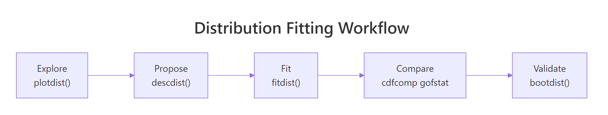
Figure 2: The five-step fitdistrplus workflow from raw data to a validated fit.
Let's fit the three standard candidates, Weibull, gamma, lognormal, and stack them on one plot.
cdfcomp() overlays the empirical CDF (black staircase) with each fitted distribution's theoretical CDF. Good fits track the staircase closely; poor fits drift. Sister functions denscomp(), qqcomp(), and ppcomp() make the same comparison on the density, Q-Q, and P-P scales.
Visuals alone are easy to misread, so pair them with gofstat():
All three statistics (Kolmogorov-Smirnov, Cramer-von Mises, Anderson-Darling) measure the distance between the empirical and fitted CDFs, smaller is better. Gamma wins on every statistic and also has the lowest AIC, which is why the gamma wins this race.
Try it: Compute the AIC gap between gamma and weibull using the fit objects. Store it in ex_aic_gap.
Click to reveal solution
Explanation: Every fitdist object stores AIC and BIC directly. A gap of 2–3 AIC points is meaningful but not decisive; gaps above 10 indicate strong preference for the lower-AIC model.
How do you fit discrete distributions like Poisson or negative binomial?
Count data, number of insurance claims per policy, arrivals per hour, visits per patient, lives on the non-negative integers and needs a discrete distribution. fitdist() handles these identically: just pass a discrete distribution name.
The Poisson's AIC is 476 points higher than the negative binomial's, an overwhelming margin. The Chi-squared p-value (1.3e-49) also rejects Poisson outright. Why? Poisson forces variance equal to the mean. Real count data is almost always overdispersed (variance > mean), and the negative binomial has a second parameter (size) that absorbs the extra variance.
var(counts) / mean(counts). Values above ~1.5 signal overdispersion and call for the negative binomial.Try it: Compute the variance-to-mean ratio of the counts vector. Store it in ex_vmr.
Click to reveal solution
Explanation: A variance-to-mean ratio of 3.5 means the sample varies 3.5× more than Poisson would allow, the negative binomial's flexibility is essential.
How do you estimate uncertainty in the fitted parameters?
Parameter estimates are themselves random variables, a different sample from the same population would have given different numbers. The summary output reports asymptotic standard errors, but those rely on large-sample theory that can mislead for small or awkward datasets. A bootstrap gives you confidence intervals without that assumption.
bootdist() refits the model to 200 parametric-bootstrap samples drawn from the fitted distribution, then reports the 2.5% and 97.5% percentiles of each parameter's sampling distribution. The gamma shape is solid at 1.38–1.93 and the rate at 0.018–0.027. If either CI crossed zero, that would be a signal the parameter isn't reliably estimated.
Try it: Extract the 95% CI for the gamma rate from the bootstrap quantile function. Store the lower and upper bounds in ex_rate_ci.
Click to reveal solution
Explanation: quantile() on a bootdist object returns a list whose quantiles element is a matrix of parameter × percentile. Indexing by the parameter name pulls out the CI directly.
Practice Exercises
Exercise 1: Pick the best fit for wind speed data
Fit gamma, Weibull, and lognormal distributions to the airquality$Wind vector. Report which distribution has the lowest AIC and store the name as a string in my_best.
Click to reveal solution
Explanation: Wind speeds are famously Weibull-distributed, so much so that wind-energy estimation uses the Weibull as its default model. sapply extracts AIC from each fit and which.min() names the winner.
Exercise 2: Prove lognormal wins when data is lognormal
Simulate 500 draws from a lognormal(meanlog = 2, sdlog = 0.6), then fit both gamma and lognormal and confirm the lognormal wins via gofstat().
Click to reveal solution
Explanation: The lognormal AIC is ~11 lower, strong evidence in its favour, and exactly what we expect since the data was generated from a lognormal. This is a good sanity check for any fitting workflow: pick a generative distribution, simulate, fit, and confirm the fitter can recover the truth.
Exercise 3: Overdispersed counts require negative binomial
Simulate 400 draws from rnbinom(400, size = 2, mu = 8) and fit both Poisson and negative binomial. Verify NB wins by a large AIC margin.
Click to reveal solution
Explanation: Poisson's AIC is ~635 points higher, essentially no support for it. Whenever a count AIC gap is this large, you are almost certainly dealing with overdispersion.
Putting It All Together
Here is the full workflow applied to a fresh column: the sepal length of the built-in iris flowers.
The skewness near zero and kurtosis near 3 land the sepal data close to the Normal reference point, and sure enough, Normal wins with AIC 221.7 versus 226.4 (gamma) and 230.3 (lognormal). The bootstrap confirms the mean is tightly estimated around 5.84 with a narrow 95% CI. You could now use this fitted Normal to simulate new plausible sepal lengths, compute percentiles, or feed it into a downstream model.
Summary
| Function | What it does |
|---|---|
fitdist(data, "name") |
Fits a univariate distribution by MLE (or MME/QME/MGE) |
summary(fit) |
Shows parameter estimates, SEs, log-likelihood, AIC, BIC |
plot(fit) |
Four-panel diagnostic: density, CDF, Q-Q, P-P |
descdist(data) |
Skewness-kurtosis summary + Cullen-Frey plot for candidate picking |
cdfcomp(list_of_fits) |
Overlays empirical and fitted CDFs to compare distributions |
denscomp, qqcomp, ppcomp |
Sister functions for density, Q-Q, and P-P comparison |
gofstat(list_of_fits) |
KS, CvM, AD statistics + AIC / BIC table for all fits |
bootdist(fit) |
Bootstrap 95% CIs for parameters |
fitdistcens() |
Fits distributions to left-, right-, or interval-censored data |
References
- Delignette-Muller, M. L. & Dutang, C., fitdistrplus: An R Package for Fitting Distributions. Journal of Statistical Software 64 (4), 1–34 (2015). Link
- fitdistrplus package vignette, Overview of the fitdistrplus package. CRAN. Link
- fitdistrplus FAQ vignette, common issues and workarounds. CRAN. Link
- Cullen, A. C. & Frey, H. C., Probabilistic Techniques in Exposure Assessment: A Handbook for Dealing with Variability and Uncertainty in Models and Inputs. Plenum, New York (1999).
- Venables, W. N. & Ripley, B. D., Modern Applied Statistics with S, 4th Edition. Springer (2002). Chapter 5: Univariate statistics.
- R Core Team, An Introduction to R. Link
Continue Learning
- Binomial and Poisson Distributions in R, when to choose each of these two discrete distributions before you even reach the fitting stage.
- Normal, t, F and Chi-Squared Distributions in R, the continuous distributions you'll most often fit, and the
d*/p*/q*/r*interface every fit relies on. - Statistical Tests in R, once you've fit a distribution, formal tests like Shapiro-Wilk or Kolmogorov-Smirnov let you put a p-value on the fit.