gt Package: Beautiful Publication-Ready Tables in R
The gt package gives you a "grammar of tables", a layered system for turning any data frame into a polished, publication-ready table with formatted numbers, styled headers, conditional colors, and footnotes, all in a few lines of R code.
By Selva Prabhakaran · Published May 13, 2026 · Last updated May 13, 2026
How Does gt() Turn a Data Frame into a Table?
Console output is fine for exploration, but reports and papers demand clean formatting. The gt package lets you pipe a data frame straight into a presentation-quality table. Let's see it in action.
RFirst gt table with tabheader
# Create your first gt tablelibrary(gt)library(dplyr)mtcars |>slice(1:5) |>gt(rowname_col ="name") |>tab_header( title ="Motor Trend Car Data", subtitle ="Top 5 vehicles from the 1974 dataset" )#> A formatted table with bold title "Motor Trend Car Data"#> Rows: Mazda RX4, Mazda RX4 Wag, Datsun 710, Hornet 4 Drive, Hornet Sportabout#> Columns: mpg, cyl, disp, hp, drat, wt, qsec, vs, am, gear, carb
The gt() function is the entry point, it takes any data frame and wraps it in a structured table object. From there, you layer on formatting with tab_header(), tab_source_note(), and other functions, just like adding layers in ggplot2.
Key Insight
gt follows a layered approach like ggplot2. Start with your data, pipe it into gt(), then chain formatting functions one at a time. Each function modifies the table without changing your underlying data.
Now let's add a source note to credit where the data came from. Source notes appear at the bottom of the table and are standard in academic publications.
RAdd source note with tabsourcenote
# Add source note and subtitlemtcars |>slice(1:5) |>mutate(name =rownames(mtcars)[1:5]) |>gt() |>tab_header( title ="Motor Trend Car Data", subtitle ="Performance metrics for 5 classic vehicles" ) |>tab_source_note( source_note ="Source: Henderson and Velleman (1981), Motor Trend magazine." )#> Same table as above, now with a footnote-style source line at the bottom#> "Source: Henderson and Velleman (1981), Motor Trend magazine."
The tab_source_note() adds a citation at the table footer. You can chain multiple source notes if the data comes from several sources.
Try it: Create a gt table from the first 6 rows of airquality with the title "New York Air Quality" and subtitle "Daily measurements, May-September 1973".
RExercise: gt table from airquality
# Try it: build a gt table from airqualityex_air <- airquality |>head(6) |>gt()# Add tab_header() with title and subtitle hereex_air#> Expected: a gt table with title "New York Air Quality"
Click to reveal solution
Rairquality gt table solution
ex_air <- airquality |>head(6) |>gt() |>tab_header( title ="New York Air Quality", subtitle ="Daily measurements, May-September 1973" )ex_air#> A formatted table showing Ozone, Solar.R, Wind, Temp, Month, Day#> with the title and subtitle displayed above the column headers
Explanation: Pipe the data into gt(), then chain tab_header() with both title and subtitle arguments.
How Do You Format Numbers, Currencies, and Percentages?
Raw numbers with many decimal places clutter your tables. The fmt_*() family reformats column values in place, no need to mutate your data first. These functions handle thousands separators, decimal precision, currency symbols, and percentages automatically.
Let's create a summary table and format the numbers for readability.
The fmt_number() function takes a columns argument (supports tidy selection) and decimals to control precision. Notice how different columns get different decimal places, chain multiple fmt_number() calls for this.
Now let's see currency and percentage formatting. These are common in business reports where you need dollar signs and percent symbols.
The fmt_currency() function adds the currency symbol, thousands separators, and two decimal places by default. The fmt_percent() function multiplies by 100 and appends the % sign. Both accept a locale argument for international formatting.
Tip
Chain multiple fmt_*() calls to format different columns in one pipeline. Each call targets specific columns and leaves the rest untouched. The order doesn't matter, gt applies all formatting when the table renders.
Sometimes your data has missing values or dates that need special handling. The sub_missing() function replaces NA with a custom string, and fmt_date() converts date columns to readable formats.
RFormat dates and handle missing
# Handle missing values and format datesdates_data <-tibble( event =c("Launch", "Review", "Update", "Maintenance"), date =as.Date(c("2026-01-15", "2026-03-22", NA, "2026-06-01")), score =c(92.5, NA, 88.1, 95.3))dates_data |>gt() |>tab_header(title ="Project Timeline") |>fmt_date(columns = date, date_style ="day_month_year") |>sub_missing(columns =everything(), missing_text ="TBD")#> event date score#> Launch 15 January 2026 92.5#> Review 22 March 2026 TBD#> Update TBD 88.1#> Maintenance 01 June 2026 95.3
The sub_missing() function with columns = everything() catches NAs in any column. You can target specific columns and use different replacement text for each.
Try it: Create a tibble with three products, a price column, and a discount column (as decimals like 0.15). Format prices as EUR currency and discounts as percentages with 0 decimals.
RExercise: Euro price and discount
# Try it: format currency and percentagesex_products <-tibble( product =c("Laptop", "Phone", "Tablet"), price =c(999.99, 699.50, 449.00), discount =c(0.15, 0.10, 0.20))ex_products |>gt()# Add fmt_currency() for price (EUR) and fmt_percent() for discount here#> Expected: prices as €999.99 and discounts as 15%, 10%, 20%
Explanation:fmt_currency(currency = "EUR") adds the euro symbol. fmt_percent(decimals = 0) rounds to whole percentages.
How Do You Add Headers, Spanners, and Row Groups?
Real-world tables often have hierarchical structure, columns that belong together under a shared label, or rows grouped by category. gt handles both with tab_spanner() for column groups and tab_row_group() for row groups.
Let's group related columns under a spanner label. Spanners add a second header row that visually ties columns together.
Each tab_spanner() call creates a header that spans the specified columns. The cols_label() function renames the individual column headers underneath, use readable names instead of the raw variable names.
Tip
Use md() inside labels for bold or italic formatting. Write cols_label(mpg = md("Miles/Gal")) to render the header in bold. This works in tab_spanner() labels too.
Now let's organize rows into groups. This is useful when your table has a categorical variable that defines natural clusters.
The tab_row_group() function filters rows using the rows argument (same syntax as dplyr's filter). Groups appear in the order you define them, with a bold label row separating each group.
Try it: Take the first 8 rows of mtcars, create a gt table, and add a spanner labeled "Engine" over the cyl and disp columns.
RExercise: Engine column spanner
# Try it: add a column spannerex_spanner <- mtcars |>slice(1:8) |>mutate(name =rownames(mtcars)[1:8]) |>select(name, mpg, cyl, disp, hp) |>gt()# Add tab_spanner() hereex_spanner#> Expected: "Engine" label spanning the cyl and disp columns
Click to reveal solution
REngine spanner solution
ex_spanner <- mtcars |>slice(1:8) |>mutate(name =rownames(mtcars)[1:8]) |>select(name, mpg, cyl, disp, hp) |>gt() |>tab_spanner(label ="Engine", columns =c(cyl, disp))ex_spanner#> A table with "Engine" spanning cyl and disp,#> mpg and hp remain ungrouped
Explanation:tab_spanner(label = "Engine", columns = c(cyl, disp)) adds a grouped header. The columns must be adjacent in the table for the spanner to render correctly, use cols_move() if needed.
How Do You Style Cells with Conditional Formatting?
Plain tables communicate data, but styled tables guide the reader's eye to what matters. The tab_style() function applies CSS-like formatting to specific cells, rows, or columns. You target locations with helper functions like cells_body(), cells_column_labels(), and cells_row_groups().
Let's start by styling the column headers with a bold font and background color.
RStyle header cells with tabstyle
# Style headers with colors and bold textmtcars |>slice(1:5) |>mutate(name =rownames(mtcars)[1:5]) |>select(name, mpg, hp, wt) |>gt() |>tab_header(title ="Styled Car Data") |>tab_style( style =list(cell_fill(color ="#4682B4"),cell_text(color ="white", weight ="bold") ), locations =cells_column_labels(everything()) )#> Column headers (name, mpg, hp, wt) now display#> with steel-blue background and white bold text#> Data rows remain with default styling
The tab_style() function takes two main arguments: style (a list of cell formatting rules) and locations (which cells to target). The cell_fill(), cell_text(), and cell_borders() helpers control background color, font properties, and border styles respectively.
Warning
tab_style() targets cells by location, not by value. To highlight cells based on their content (like "all values above 20"), pass a filtering expression to the rows argument in cells_body().
Now let's apply conditional formatting, highlighting rows where a value exceeds a threshold. This is one of the most practical uses of tab_style().
RHighlight cells above a threshold
# Conditional formatting: highlight high-MPG carsmtcars |>slice(1:10) |>mutate(name =rownames(mtcars)[1:10]) |>select(name, mpg, hp, cyl) |>gt() |>tab_header(title ="Fuel Efficiency Highlights") |>tab_style( style =cell_fill(color ="#d4edda"), locations =cells_body( columns = mpg, rows = mpg >20 ) ) |>tab_style( style =cell_text(color ="#dc3545", weight ="bold"), locations =cells_body( columns = hp, rows = hp >200 ) )#> MPG cells above 20 highlighted with light green background#> HP cells above 200 displayed in bold red text#> Other cells remain with default styling
Each tab_style() call is independent, you can stack multiple conditional rules. The rows argument accepts any logical expression that references column values, just like dplyr::filter().
For continuous color scales across an entire column, use data_color(). This maps numeric values to a gradient, creating a heatmap effect.
RColour scale with datacolor
# Color scale across a numeric columnmtcars |>slice(1:8) |>mutate(name =rownames(mtcars)[1:8]) |>select(name, mpg, hp) |>gt() |>tab_header(title ="Performance Heatmap") |>data_color( columns = mpg, palette =c("#dc3545", "#ffc107", "#28a745") ) |>data_color( columns = hp, palette =c("#28a745", "#ffc107", "#dc3545") )#> MPG column: green for high values, red for low (higher is better)#> HP column: reversed, red for high values (higher = more power)#> Each cell background blends along the gradient based on its value
The data_color() function maps the minimum value to the first palette color and the maximum to the last. The palette accepts any hex colors or named R colors. Note the reversed palette for HP, higher horsepower gets a warmer color to signal "more intense."
Try it: Take the first 6 rows of mtcars and highlight all cells in the mpg column where the value exceeds 21 with a light yellow background ("#fff3cd").
Explanation: The rows = mpg > 21 inside cells_body() filters which rows receive the style. Only the mpg column is affected because we specified columns = mpg.
How Do You Add Footnotes and Source Notes?
Professional tables cite their sources and clarify specific values with footnotes. gt handles both automatically, footnotes get numbered markers, and source notes appear at the table footer.
RAdd footnotes to header cells
# Add footnotes to specific cells and column headersmtcars |>slice(1:5) |>mutate(name =rownames(mtcars)[1:5]) |>select(name, mpg, hp, wt) |>gt() |>tab_header( title ="Vehicle Comparison", subtitle ="Selected models from Motor Trend 1974" ) |>tab_footnote( footnote ="Miles per US gallon", locations =cells_column_labels(columns = mpg) ) |>tab_footnote( footnote ="Gross horsepower", locations =cells_column_labels(columns = hp) ) |>tab_footnote( footnote ="Lightest vehicle in this selection", locations =cells_body(columns = wt, rows = wt ==min(wt)) ) |>tab_source_note("Source: Motor Trend US magazine, 1974")#> mpg column header shows superscript "1", hp shows "2"#> The lightest vehicle's wt cell shows superscript "3"#> Footer: 1. Miles per US gallon 2. Gross horsepower#> 3. Lightest vehicle in this selection#> Source: Motor Trend US magazine, 1974
Each tab_footnote() auto-numbers its marker. You can target column headers with cells_column_labels(), specific body cells with cells_body(), or even the title with cells_title(). The tab_source_note() is separate and always appears last in the footer without a number.
Note
Footnotes auto-number sequentially. You don't control the numbering, gt assigns numbers in the order you call tab_footnote(). If you reorder the calls, the numbers change.
Try it: Create a gt table from the first 4 rows of iris, add a footnote saying "Length in centimeters" to the Sepal.Length column header, and add a source note crediting "Anderson, 1935".
RExercise: Footnote plus source note
# Try it: add a footnote and source noteex_fn <- iris |>head(4) |>gt()# Add tab_footnote() and tab_source_note() hereex_fn#> Expected: superscript "1" on Sepal.Length header#> Footer with footnote text and source attribution
Explanation:cells_column_labels(columns = Sepal.Length) targets the header cell. The source note is a separate footer element that doesn't get numbered.
How Do You Apply Themes and Custom Styling?
The default gt table looks clean, but you'll often want a consistent look across all your tables. The opt_stylize() function applies pre-built themes with a single call, while tab_options() gives you fine-grained control over every visual detail.
RQuick theming with optstylize
# Quick theming with opt_stylize()mtcars |>slice(1:5) |>mutate(name =rownames(mtcars)[1:5]) |>select(name, mpg, hp, wt) |>gt() |>tab_header(title ="Styled with opt_stylize()") |>opt_stylize(style =6, color ="cyan")#> Table now has a cyan-themed design:#> colored header row, alternating row stripes,#> clean borders, and professional typography
The opt_stylize() function offers 6 built-in styles (1 through 6) and several color options including "blue", "cyan", "pink", "green", "red", and "gray". Style 1 is subtle, style 6 is bold. Pick one that matches your report's tone.
For full control, tab_options() lets you set individual properties, font family, font size, row padding, border styles, header colors, and more.
RFine-grained control with taboptions
# Fine-grained control with tab_options()mtcars |>slice(1:6) |>mutate(name =rownames(mtcars)[1:6]) |>select(name, mpg, hp, wt) |>gt() |>tab_header( title ="Custom Theme Example", subtitle ="Fine-tuned with tab_options()" ) |>tab_options( heading.background.color ="#2C3E50", heading.title.font.size =px(18), column_labels.background.color ="#34495E", column_labels.font.weight ="bold", column_labels.font.size =px(13), row.striping.include_table_body =TRUE, row.striping.background_color ="#F8F9FA", table.border.top.style ="solid", table.border.top.color ="#2C3E50", table.font.size =px(13) )#> Dark header with white text, bold column labels on charcoal background#> Alternating light gray stripes on body rows#> Solid dark border at the top of the table
That's a lot of options, and tab_options() supports over 100 properties. The ones above cover the most common needs: header styling, column label appearance, row striping, borders, and font sizes.
Tip
Wrap your custom tab_options() in a reusable function to create a personal theme. Call my_theme <- function(gt_tbl) gt_tbl |> tab_options(...), then apply it to any table with my_table |> my_theme().
Let's create that reusable theme and apply it.
RBuild a reusable theme function
# Create a reusable custom thememy_report_theme <-function(gt_tbl) { gt_tbl |>tab_options( heading.background.color ="#1B4F72", column_labels.background.color ="#2E86C1", column_labels.font.weight ="bold", row.striping.include_table_body =TRUE, row.striping.background_color ="#EBF5FB", table.font.size =px(13), heading.title.font.size =px(16) )}# Apply the theme to any tablemtcars |>slice(1:4) |>mutate(name =rownames(mtcars)[1:4]) |>select(name, mpg, hp) |>gt() |>tab_header(title ="Reusable Theme Demo") |>fmt_number(columns =c(mpg, hp), decimals =1) |>my_report_theme()#> Table with consistent blue theme applied from the function#> Same theme works on any gt table by piping into my_report_theme()
Now every table in your report gets the same professional look with a single function call. You can keep the theme function in a shared script and source it across projects.
Try it: Apply opt_stylize(style = 3, color = "green") to a gt table from the first 4 rows of iris, then override the title font size to px(20) using tab_options().
RExercise: Combine optstylize and taboptions
# Try it: combine opt_stylize with tab_optionsex_theme <- iris |>head(4) |>gt() |>tab_header(title ="Themed Iris Table")# Add opt_stylize() and tab_options() hereex_theme#> Expected: green-themed table with larger title text
Click to reveal solution
RThemed iris table solution
ex_theme <- iris |>head(4) |>gt() |>tab_header(title ="Themed Iris Table") |>opt_stylize(style =3, color ="green") |>tab_options(heading.title.font.size =px(20))ex_theme#> Green-themed table (style 3) with a larger 20px title#> opt_stylize sets the base theme, tab_options overrides individual properties
Explanation:opt_stylize() applies the base theme, then tab_options() overrides specific properties. The order matters, place overrides after the base theme.
Practice Exercises
Exercise 1: Formatted Summary Table
Build a summary statistics table from airquality. Group by Month, compute the mean and standard deviation of Ozone (ignore NAs), format all numbers to 1 decimal place, add the title "NYC Air Quality by Month", and include a source note crediting "NY State Dept of Conservation".
RExercise: Monthly ozone summary table
# Exercise 1: Build a formatted summary table# Hint: group_by() + summarise() first, then pipe to gt()# Use na.rm = TRUE in mean() and sd()# Write your code below:
Explanation: Summarise first, then pipe the result into gt(). fmt_number(decimals = 1) rounds both columns. cols_label() gives human-readable headers.
Exercise 2: Styled Comparison Table
Create a table from mtcars (first 10 rows) with columns name, mpg, hp, and cyl. Add a spanner "Performance" over mpg and hp. Highlight mpg cells above 20 in green ("#d4edda") and below 16 in red ("#f8d7da"). Apply opt_stylize(style = 1, color = "blue") and add a title.
RExercise: Styled comparison table
# Exercise 2: Build a styled comparison table# Hint: use two tab_style() calls for conditional formatting# Write your code below:
Explanation: Two tab_style() calls with different rows conditions create a two-tone conditional format. opt_stylize() applies the base theme underneath.
Exercise 3: Complete Report Table
Build a "report card" table. Create sample data for 6 students with columns: student, subject (Math or Science), score, and grade (A/B/C). Add row groups by subject. Format scores to 0 decimals. Color grade cells, green for A, yellow for B, red for C. Add a footnote on the score column header saying "Out of 100 points". Apply a custom theme.
RExercise: Student report card table
# Exercise 3: Build a report card table# Hint: create the tibble first, then build the gt table layer by layer# Write your code below:
Click to reveal solution
RReport card solution
report_data <-tibble( student =c("Alice", "Bob", "Carol", "Dave", "Eve", "Frank"), subject =c("Math", "Math", "Math", "Science", "Science", "Science"), score =c(92, 78, 85, 67, 95, 88), grade =c("A", "C", "B", "C", "A", "B"))report_data |>gt() |>tab_header( title ="Student Report Card", subtitle ="Mid-term Results 2026" ) |>tab_row_group(label ="Mathematics", rows = subject =="Math") |>tab_row_group(label ="Science", rows = subject =="Science") |>fmt_number(columns = score, decimals =0) |>tab_style( style =cell_fill(color ="#d4edda"), locations =cells_body(columns = grade, rows = grade =="A") ) |>tab_style( style =cell_fill(color ="#fff3cd"), locations =cells_body(columns = grade, rows = grade =="B") ) |>tab_style( style =cell_fill(color ="#f8d7da"), locations =cells_body(columns = grade, rows = grade =="C") ) |>tab_footnote( footnote ="Out of 100 points", locations =cells_column_labels(columns = score) ) |>opt_stylize(style =6, color ="gray")#> Gray-themed table with row groups "Mathematics" and "Science"#> Grade cells: green for A, yellow for B, red for C#> Score header has footnote marker linking to "Out of 100 points"
Explanation: Three tab_style() calls target different grade values. tab_row_group() organizes students by subject. The footnote targets the score column header.
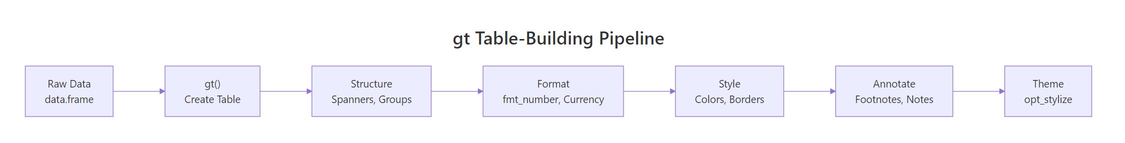
Putting It All Together
Let's build a polished table from scratch, taking raw mtcars data through the complete gt pipeline: summarise, structure, format, style, annotate, and theme.
REnd-to-end mtcars gt workflow
# Complete example: from raw data to publication-ready tablefinal_tbl <- mtcars |>mutate(name =rownames(mtcars)) |>group_by(cyl) |>summarise( count =n(), avg_mpg =mean(mpg), avg_hp =mean(hp), avg_wt =mean(wt), best_mpg =max(mpg) ) |>gt() |>tab_header( title ="Vehicle Performance by Engine Size", subtitle ="Summary statistics from the 1974 Motor Trend dataset" ) |>tab_spanner(label ="Averages", columns =c(avg_mpg, avg_hp, avg_wt)) |>cols_label( cyl ="Cylinders", count ="N", avg_mpg ="MPG", avg_hp ="HP", avg_wt ="Weight (tons)", best_mpg ="Best MPG" ) |>fmt_number(columns =c(avg_mpg, avg_hp), decimals =1) |>fmt_number(columns = avg_wt, decimals =2) |>fmt_number(columns = best_mpg, decimals =1) |>tab_style( style =cell_fill(color ="#d4edda"), locations =cells_body(columns = avg_mpg, rows = avg_mpg >25) ) |>tab_style( style =cell_fill(color ="#f8d7da"), locations =cells_body(columns = avg_mpg, rows = avg_mpg <16) ) |>data_color( columns = avg_hp, palette =c("#EBF5FB", "#2E86C1") ) |>tab_footnote( footnote ="Best fuel economy in this engine class", locations =cells_column_labels(columns = best_mpg) ) |>tab_source_note("Source: Henderson & Velleman (1981), Motor Trend magazine") |>tab_options( heading.background.color ="#2C3E50", column_labels.background.color ="#34495E", column_labels.font.weight ="bold", row.striping.include_table_body =TRUE, row.striping.background_color ="#F8F9FA", table.font.size =px(13) )final_tbl#> A polished 3-row summary table:#>#> Vehicle Performance by Engine Size#> Summary statistics from the 1974 Motor Trend dataset#>#> Averages#> Cylinders N MPG HP Weight (tons) Best MPG*#> 4 11 26.7 82.6 2.29 33.9 (green MPG cell)#> 6 7 19.7 122.3 3.12 21.4#> 8 14 15.1 209.2 4.00 19.2 (red MPG cell)#>#> * Best fuel economy in this engine class#> Source: Henderson & Velleman (1981), Motor Trend magazine
This pipeline demonstrates every major gt feature: structural elements (header, spanner, column labels), formatting (decimal precision), styling (conditional fills, color gradients), annotations (footnote, source note), and theming (custom options). Each layer builds on the previous one without modifying the underlying data.
Summary
Here are the key gt functions organized by what they do: