R Maps for US States & Counties: ggplot2 + tigris Package
The tigris package downloads US Census TIGER/Line shapefiles directly into R as ready-to-plot sf objects, so you can build state and county maps with ggplot2's geom_sf() in a few lines of code, no manual file downloads or coordinate-system wrangling.
How do I get a US state or county map into R?
Most US-mapping pain in R comes from the file plumbing: finding the right shapefile, loading it correctly, getting the projection right, joining your data on a sometimes-mysterious FIPS column. The tigris package collapses all of that to one function call. You get an sf data frame back, ready for geom_sf(). This section shows the shortest path from a blank R session to a national state map you can hand to a stakeholder.
The short version is three function calls plus a plot. states() fetches the shapefile, shift_geometry() repositions Alaska and Hawaii for a compact display, and geom_sf() draws it. The cb = TRUE argument requests the cartographic (simplified) boundaries, which load fast and look clean at thematic-map scale.
The result is a clean national outline with all 50 states plus DC, Alaska and Hawaii repositioned for compact display. Behind the scenes tigris downloaded a small (~1 MB) shapefile from the Census Bureau, parsed it into an sf object, and ggplot rendered it via geom_sf(). No file paths, no coordinate-system conversions, no readOGR() boilerplate.
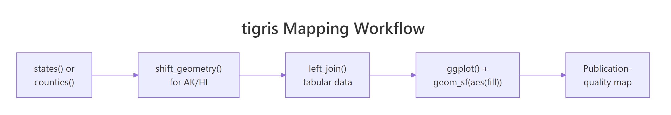
Figure 1: The tigris-to-ggplot pipeline. Each step is a single function call.
Try it: Replace the national call with one that fetches just the counties of Maine, then plot them.
Click to reveal solution
counties() accepts a state name, a 2-letter abbreviation, or a FIPS code as its first argument. With cb = TRUE it returns 16 simple-feature rows, one per county, each with a geometry column ready for ggplot.
What does cb = TRUE actually do?
The cb argument toggles between two file families. With cb = TRUE you get cartographic boundary files: the Census Bureau's simplified, thematic-map-friendly shapes (file sizes in the kilobytes to low megabytes). With cb = FALSE you get the full TIGER/Line files: every coastal jiggle, every island, every river boundary at full resolution (file sizes ten to a hundred times larger). Comparing one state's two versions makes the tradeoff obvious.
Florida at cartographic resolution is 12 KB. Florida at full TIGER resolution is 1.7 MB, more than 100x larger, with thousands of additional vertices along its coastline. For thematic maps that show data colored by state or county, the simplified version renders in a fraction of the time and looks identical at typical screen resolutions.
Try it: Compare object sizes for your home state at both resolutions.
Click to reveal solution
California's full version is about 150x larger than its cartographic version. The visual difference at a national map scale is essentially zero. The compute cost difference is enormous.
How do I color counties by a value (choropleth)?
A choropleth map colors each region by a number. The recipe is always the same: get the sf object, get a tabular data frame keyed by the same identifier (usually GEOID, the FIPS code), left_join() them, and pass the value column to geom_sf(aes(fill = ...)). tigris and dplyr cooperate cleanly because an sf object is just a data frame with an extra geometry column.
The join lines up because both data frames carry the same GEOID column (the 5-digit county FIPS code). After joining, the sf object has a new metric column the fill aesthetic can read. The viridis palette is the standard choice for thematic maps because it stays readable in grayscale and for color-blind viewers.
left_join(), filter(), mutate(), select(), summarise() all behave normally. The geometry column tags along automatically and ggplot draws whatever ends up in the result.Try it: Swap the fill in the example for a different column, for example a categorical bin like metric_bin <- cut(metric, 4).
Click to reveal solution
Switching from scale_fill_viridis_c (continuous) to scale_fill_viridis_d (discrete) handles the categorical bins. cut() turns a numeric column into a factor with named breakpoints, useful when stakeholders prefer discrete categories over a smooth gradient.
How do I filter to one state's counties or a region?
Three patterns cover almost every use case. First, ask tigris for one state directly with counties("state"). Second, fetch all counties once and use dplyr::filter() on STATEFP (the 2-digit state FIPS code) to slice out any region. Third, combine the same fetch with a hand-picked vector of state codes for arbitrary multi-state regions like New England or the Mountain West.
STATEFP is the standard 2-character state FIPS code Census uses everywhere. Once you have one nationwide pull, you can re-slice to any geographic group without re-fetching. For batch work this is faster than calling counties() once per state.
Try it: Filter to the Mountain West instead (CO=08, UT=49, WY=56, MT=30, ID=16, NV=32).
Click to reveal solution
The same recipe extends to any custom region. Census FIPS codes never change, so you can hard-code regional vectors once and reuse them across analyses.
What about Alaska, Hawaii, and projection gotchas?
Two things trip up most US-map newcomers. First, tigris returns geometries in NAD83 (EPSG:4269), a longitude-latitude system that produces a slightly stretched-looking national map and places Alaska and Hawaii thousands of miles from the lower 48. Second, you almost always want to relocate Alaska and Hawaii into a compact inset so they sit beneath the southwestern US. tigris ships shift_geometry() for exactly this purpose.
shift_geometry() rescales and translates Alaska and Hawaii into a standard inset position. With preserve_area = TRUE it keeps the relative areas roughly correct (Alaska is still much larger than any lower-48 state). The position = "below" option places both insets beneath the contiguous US; "outside" puts AK upper-left and HI lower-left, matching most published US maps.
Try it: Render the same data with and without shift_geometry, side by side, to feel the difference.
Click to reveal solution
The default geometry stretches the plot frame from far western Alaska to Puerto Rico, leaving a tiny lower-48 in the middle. Shifted geometry compresses everything into a familiar magazine-style inset.
Practice Exercises
Exercise 1: One-state county choropleth
Pick any state. Build a small synthetic dataset with one numeric column per county. Join it to the county sf object and produce a polished choropleth with a viridis fill, white county boundaries, and theme_void().
Click to reveal solution
The recipe is generic, swap "TX" for any state and the column name for any metric.
Exercise 2: National choropleth with shift_geometry
Build a national map at the state level with a simulated value. Use shift_geometry(), a viridis fill, and a polished theme with a caption.
Click to reveal solution
The combination of shift_geometry, a viridis palette, and scale_fill_viridis_c(labels = scales::dollar_format()) is the workhorse template for client-ready national maps.
Complete Example: Population Density Visualization
Combine base R's built-in state.area and state.name vectors with tigris to build a real population-density map. The point is to show how external state-level data joins cleanly into the tigris workflow.
Two real-world details show up here. First, the join key is NAME, not GEOID, because the base R vectors use full state names. tigris exposes both columns so you can pick whichever matches your external data. Second, density spans a couple orders of magnitude (rural Alaska to dense New Jersey), so a log-transformed fill scale is essential for a readable map.
Summary
| Function | Returns | When to use |
|---|---|---|
states(cb = TRUE) |
sf with 50 states + DC + territories | National maps |
counties(state, cb = TRUE) |
sf with one state's counties | Single-state choropleth |
counties(cb = TRUE) |
sf with all 3,000+ US counties | Multi-state regions, custom slices |
shift_geometry() |
Same sf with AK/HI repositioned | Compact national display (always use for national thematic maps) |
cb = TRUE |
Simplified cartographic boundaries | Default for thematic maps (fast, small) |
cb = FALSE |
Full TIGER/Line resolution | Coastline-accurate work only |
References
- tigris on GitHub: github.com/walkerke/tigris. Source code, vignettes, and changelog.
- Walker, K. Analyzing US Census Data: Methods, Maps, and Models in R, 2023. walker-data.com/census-r. Chapter 5 covers tigris workflows.
- Wickham, H., Navarro, D., Pedersen, T. L. ggplot2: Elegant Graphics for Data Analysis, 3rd ed. Chapter 6 on Maps. ggplot2-book.org/maps.html.
- Pebesma, E. "Simple Features for R: Standardized Support for Spatial Vector Data." R Journal 10(1), 2018. journal.r-project.org/archive/2018/RJ-2018-009.
- US Census Bureau. TIGER/Line Shapefiles Technical Documentation. census.gov/programs-surveys/geography.
Continue Learning
- Choropleth Maps in R, the parent post that covers ggplot2 + sf choropleth recipes from first principles.
- Spatial Data in R with sf, the foundations of simple features that tigris builds on.
- 3D Maps in R, the next step when 2D thematic mapping is not enough.